Improving site conversion rates through the use of data-guided choices
Time line
Nov '21 - Jan '22
Team
1 Designer (Myself), 2 Developers,
1 Marketeer,
1 Project Manager.
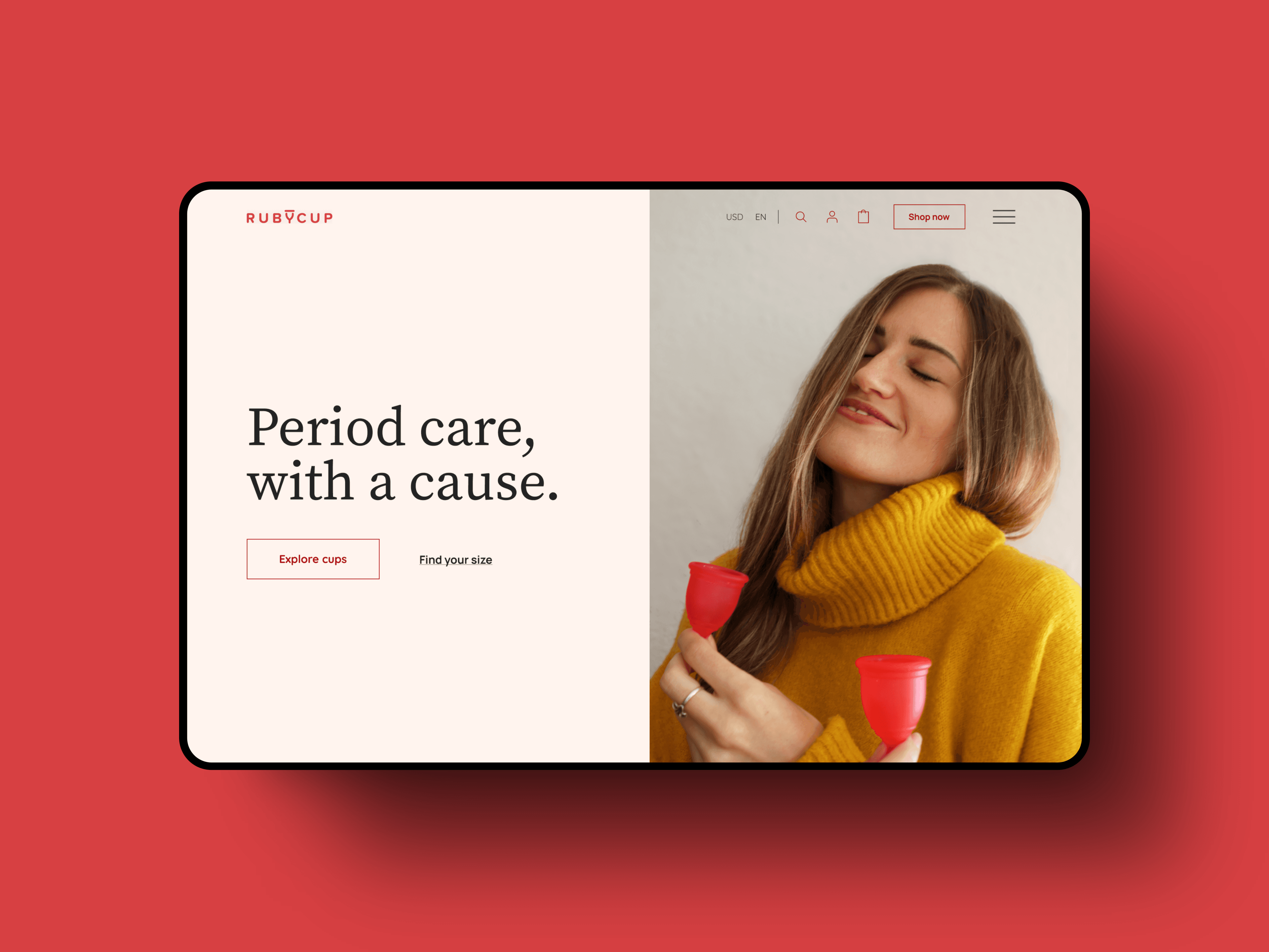
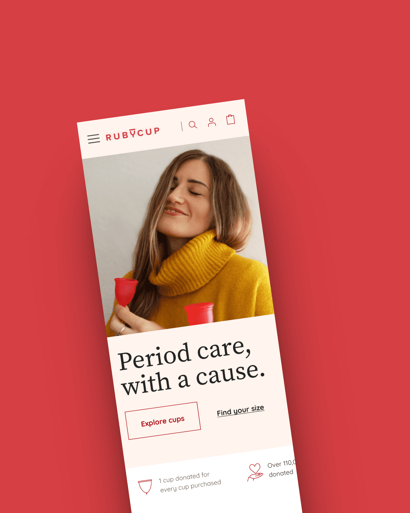
Ruby Cup sells menstrual cups, sterilisers, Kegel trainers, and panties for women in England, Germany & USA. They want to redefine the user experience for their eCommerce site. Also they had plans for scaling up their service accross more regions of Europe and UAE.
my role
Conducting UX audits and data analysis
Identifying user pain points and business bottlenecks
Designing responsive, accessible UI solutions
Ensuring the design was scalable across regions

Problem
The business goal

User Persona
UX Audit
Navigation & Information Architecture: We examined how easily users could find products, access support content, and navigate between categories.
Content Clarity: We looked for ambiguity in product descriptions, sizing information, and calls-to-action.
Visual Design & Accessibility: Assessed color contrast, font readability, tap target sizes, and mobile responsiveness.
Checkout Flow: Evaluated the complexity, number of steps, and visibility of trust signals (e.g., payment icons, return policies).
Performance Bottlenecks: We assessed page load times, image weights, and responsiveness, especially on mobile and slower networks.
Google Analytics Data Review
Extracting and Understanding users data


Key insights
High Bounce Rates on Product Detail Pages (PDPs): Users exited before engaging with the “Add to Cart” action, especially on mobile.
Drop-off in Checkout Funnel: A significant portion of users abandoned the site at the shipping method or payment step.
Device Usage Patterns: Over 70% of traffic came from mobile devices, yet the site was not fully optimized for small screens.
Top Exit Pages: These included FAQ, PDPs, and the first step of checkout—indicating unclear or insufficient information.
Load Time Metrics: The Time to Interactive (TTI) exceeded 6 seconds on average, especially on 3G and 4G networks, affecting mobile users adversely.
Key Problems Identified
Brand Experience Disconnect
The current site design feels harsh and visually cluttered, failing to reflect Ruby Cup’s calm, empowering, and body-positive brand personality.
There's a lack of emotional storytelling or lifestyle content. The site only "sells the product" without conveying the experience, comfort, or purpose behind it.
Cluttered and Outdated UI
The layout feels packed with no clear visual breathing space.
Inconsistent design patterns and poor hierarchy contribute to cognitive overload and fatigue, especially on product pages.
Missing Human Touch
The site lacks a humanizing factor real stories, testimonials, community involvement, or relatable imagery especially important when dealing with intimate products like menstrual cups.
Users seek reassurance, empathy, and relatability, which are currently missing.
Limited Global Accessibility
The site currently does not support multilingual access, which alienates non-English speakers, even though Ruby Cup has a presence in Germany and is planning to scale further across Europe and the UAE.
Performance & Conversion Barriers
Page load time is slow due to unoptimized components and images.
Conversion funnels show drop-offs at product detail and checkout stages.
High bounce rates indicate that users aren't finding immediate value or trust on landing.
Poor Information Architecture
Essential information such as product benefits, sizing guidance, or return policies are either buried or fragmented.
Navigation is unintuitive, leading to confusion, particularly on mobile.


Product-Centric, Decluttered Layout
Redesigned page structure with a clear visual hierarchy, making products the hero of the experience. Consolidated product descriptions, how-to-use guides, reviews, and FAQs into well-organized sections. Added interactive sizing guides, use-case illustrations, and user-generated content for better engagement.

Mobile-First Optimization
Designed for small screens first: simplified layouts, collapsible filters, large tap targets. Ensured the design was responsive and touch-gesture friendly.Prioritized accessibility with readable text sizes, color contrast, and screen reader compatibility.

New users initially feared the product, so we highlighted its simplicity and ensured transparency about its safety.

Added a testimonial slider, real user stories, and community quotes to instill trust.

We tried to communicate the users how the products can be used in a simple effective way by providing simple interactions.

Introduced language selection and multi-currency support to cater to users in Germany, USA, and future markets like the UAE. Added location-based shipping and tax info to reduce last-minute surprises during checkout.

The brand initiated a program where customers could contribute to fighting period poverty with every purchase. By highlighting this, we made customers feel like they were actively part of the cause, which positively impacted the brand's perception.

The existing branding was too harsh, with an overwhelming use of red, which is often associated with the pain and blood flow women experience during their period. To avoid evoking these uncomfortable feelings, we chose to use softer colors and a gentler branding approach.

Simplified & Trustworthy Checkout
Streamlined checkout into three intuitive steps: Cart → Shipping Info → Payment. Added real-time validation, trust badges, and transparent delivery/return details. Enabled guest checkout and auto-fill support for smoother form handling.

This enabled us to achieve uniformity throughout the site, thereby enriching the users' comprehension of its use case.