Time line
May '24 - Sep '24
Team
1 Designer (Myself), 3 Developers,
2 Data Engineers,
1 Business Analyst, 1 Product Owner,
1 System Architect.
Outcomes
Improved Productivity Across Teams
Data Load and Report Generation teams could complete end-to-end workflows 2x faster due to fewer clicks, guided flows, and smarter defaults.
Faster month-end reporting cycle
Quick data extraction and inpage bulk export options improved delivery timelines.
75% error reduction in user navigation errors
Improved IA and consistent task-based navigation helped users find what they needed efficiently.
85% reduction in onboarding effort
New users onboarded with little to no training using product tour.
Higher User Satisfaction & Adoption
With inclusive design improvements and simplified workflows, app adoption increased across teams.
my role

Problem
BUSINESS GOALS
Streamline reporting and data workflows to meet operational timelines.
Reduce manual workload and errors through smart UX.
Enable faster decision-making by ensuring timely delivery of critical reports.
Improve adoption and reduce onboarding time for global teams.
The challenges faced
This redesign project came with a set of complex challenges, both from a user experience and domain perspective. These obstacles helped shape a more thoughtful and user-centered approach to the final solution.
No proper BRD defined
Global User Base vs Local Research Scope
Domain Complexity & Technical Jargon

Viewing - 1 / 4
One of the primary goals of the stakeholder sessions was to gain a clear understanding of the end-to-end process from both business and operational perspectives. These sessions were crucial in shaping the direction of the project and ensuring that the redesign addressed both user pain points and business goals.
OBJECTIVES OF THE SESSION
Identify and understand existing pain points reported by internal stakeholders across various domains.
Uncover domain-specific terminology and process dependencies.

Viewing - 2 / 4
Discovery Stage (Research)
To better understand user challenges and uncover pain points, user interviews were conducted with enterprise users in India, representing both the data load and report generation teams.
KEY ITEMS discussed
Actual end Users


Data Load Team
They are the team who loads the data from various sources for the purpose of report generation.
Reports Genenration Team
They are the team that generates customised reports based on the requirements.
Total Users
1400+
Geography
Majorly from India, Few Globally
Gender Distribution
75%
Male
25%
Female
0%
Others
Why I Skipped Heuristic Analysis and Chose User Interviews Instead
About user interviews
Key Objectives
Discover unmet needs and expectations.
To understand how users navigate the current system.
Identify blockers in completing key tasks.
Capture emotional responses to interface interactions.
Uncover pain points in task flows (especially uploads & reporting).
Interview context
Method
Regions Covered for Interviews
Duration
Users involved in interviews
7
To better understand user frustrations, motivations, and behavior patterns, I created an Empathy Map based on insights gathered from user interviews across users in India.
This helped me step into the users’ shoes and design solutions that are not only functional but also emotionally resonant and easier to adopt.


User Personas

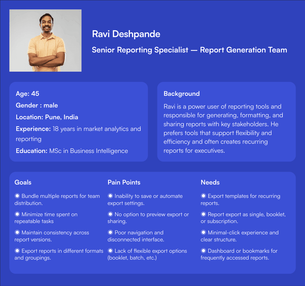
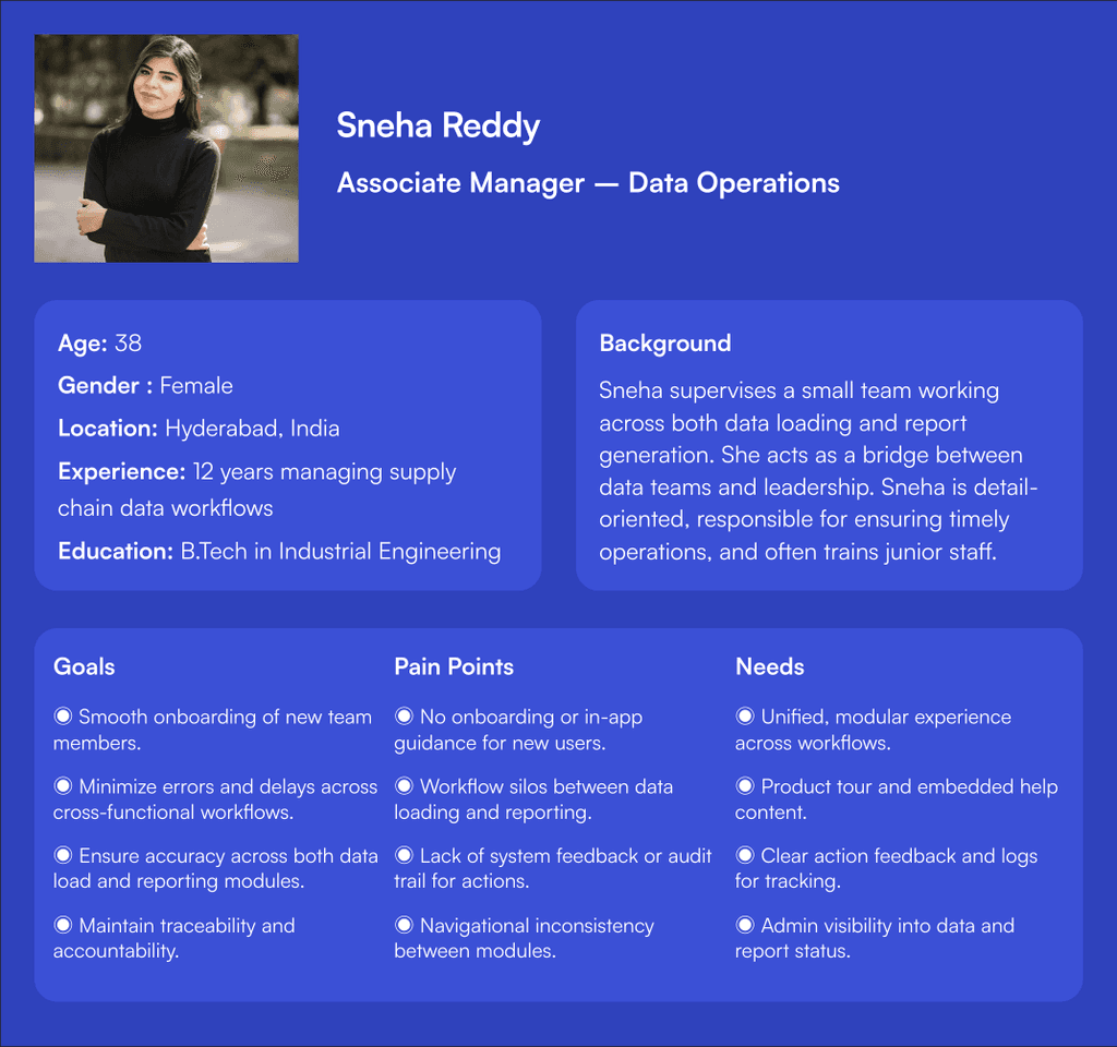
01
Steep Learning Curve Is a Major Barrier
Users, especially new ones, struggle to get started without peer support.
There’s no guided onboarding, tooltips, or helpful prompts.
This results in dependency, wasted time, and slow adoption.
02
Fragmented access casuing poor Navigation & Confusing IA
Users face inefficient navigation due to needing separate URLs or entry points for each domain & modules (Finance, Market, Supply Chain), forcing a disconnected experience.
This leads to excessive back-and-forth & higher interaction cost particularly during critical periods like reporting cycles.
03
Workflows Are Rigid, Time-Consuming, and Error-Prone
Both data load and report generation involve high interaction cost.
There’s no undo, no validation, and users must restart entire workflows on failure.
04
System Feedback and Error Handling Are Practically Non-existent
Users often receive no confirmation or ambiguous error messages.
This leads to trial-and-error behavior, frustration, and loss of trust.
05
Accessibility and Inclusivity Are Ignored
Users face strain due to small fonts, lack of dark mode, and no language support.
The interface is not friendly to differently-abled users or regional diversity..
06
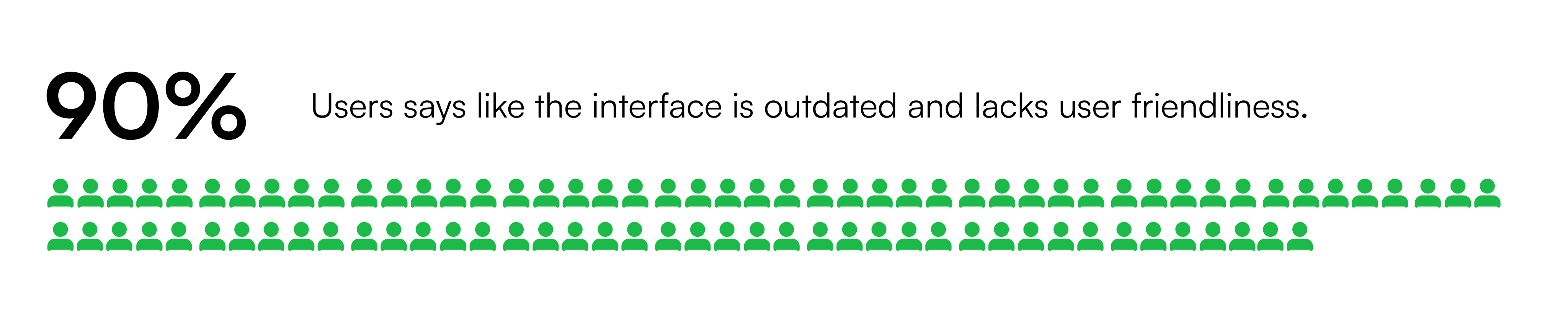
UI Design Feels Outdated and Unintuitive
Users perceive the system as old and clunky, lacking visual cues or modern design patterns.
This negatively affects user satisfaction and motivation to use the system.
Viewing - 3/ 4
Ideation & Strategy
Goals of the Ideation Phase
To generate practical, user-centered solutions that address the pain points uncovered during researc
Collaboration with stakeholders to validate early ideas and avoid technical misalignment.
To collaborate, discuss and define the key features for this release.
Core UX pillars
Learnability
First-time experience, onboarding, guided tutorials.
Clarity
Clear navigation, domain separation, feedback on actions.
Efficiency
Shortcuts, customizations and streamlined workflows.
Accessibility
WCAG 2.1 compliance, keyboard navigation, color contrast
Scalability
Modular workflows, domain-agnostic UI design patterns
Consistency
Unified components across domains with shared interactions
KEY GOALS
Simplify User Experience
Reduce cognitive load and streamline navigation and workflows.
Increase Adoption
Improve onboarding and make the system accessible for new users. |
Boost Efficiency
Shorten time-to-task through modern design and automation. |
Minimize Errors
Enhance feedback systems and validation. |
Encourage Insight-Driven Use
Enhance reporting with customizable and dynamic options.
Participants involved
Criteria for Evaluating & Selecting Ideas
Examples of Incorporating Research Insights
Key Design Decisions
01
Navigation & Architecture
Re-organize menus based on user goals rather than system structure.
Use persistent navigation, icons, and color-coded domains to aid orientation.
02
Guided & Adaptive Onboarding
First-time user journeys with tooltips, task highlights, and video walkthroughs
“Start here” guided flows for both Data Load and Report Generation
03
Process driven instead of domain & module driven
To build the entire application from the point of process instead of domain. Just to bifurcate data-load and report- generation modules.
04
Data load experience
Simplify the entire process of this data load by implementing refined flows and reduced interactions. And by implementing better ways to load data.
05
Report generation experience
Implement innovative ways to generate report in addition to the existing ways.
Enhance reporting with customizable and dynamic options.
06
Feedback and error handling
Inline success/error toasts
Error modals with "What went wrong & how to fix it.
Clear messages like “Upload failed due to missing headers. View required format"
07
Inclusivity & accessibility
Enabling basic color contrasts, proper font scaling and proper labelling etc.
Tooltips and descriptive ARIA labels
08
Modern UI Enhancements
New modern visual design adapting to the brand guidelines of Unilever.
Viewing - 4/ 4
Design Execution Phase
KEY ITEMS discussed
We Set deadlines and milestones.
what are the key KPI's that need to be achieved along the way?
Identify any constraints or limitations legal or other constraints that will impact the project's goals or objectives?
Connected with people from various tech fronts to understand the technologies that are used and had a ice breaker session with the cross functional team on planning for collaboration.
Information architecture
To design an IA that truly reflects user workflows and reduces friction, I followed a structured, research-informed approach.
Grouped by Functional Roles, Not Just Domains
Instead of organizing content purely by domain (Finance, Market, Supply Chain), I focused on functional intent — grouping screens and actions based on whether a user was loading data, generating reports, or managing exports.
Used Noun + Verb-Based Labeling
For the Information Architecture, I followed a noun + verb approach using nouns for navigation labels (like Extract, Load, Reports) to clearly define sections, and verbs for actions and call-to-buttons (like Upload File, Extract Report, Load Report) to guide users on what they can do. This method helped create a clear distinction between where users are and what actions they can take, making the interface easier to understand and navigate.
Prioritized Key Actions & Visibility
High-impact tasks like “Export as Booklet” or “Extract Data” were surfaced more prominently to reduce interaction cost and minimize user effort.
Validated Through Iteration
The IA was reviewed with product teams and validated through feedback loops during wireframing and high-fidelity stages, ensuring alignment with real-world usage and terminology.

User flows
It allowed us to align on the intended user journey early on, avoiding costly rework later.
Each business function had slightly different workflows, and these nuances needed to be captured and normalized where possible.
Stakeholders also helped identify edge cases, data dependencies, and compliance-related checkpoints that shaped the flow logic.

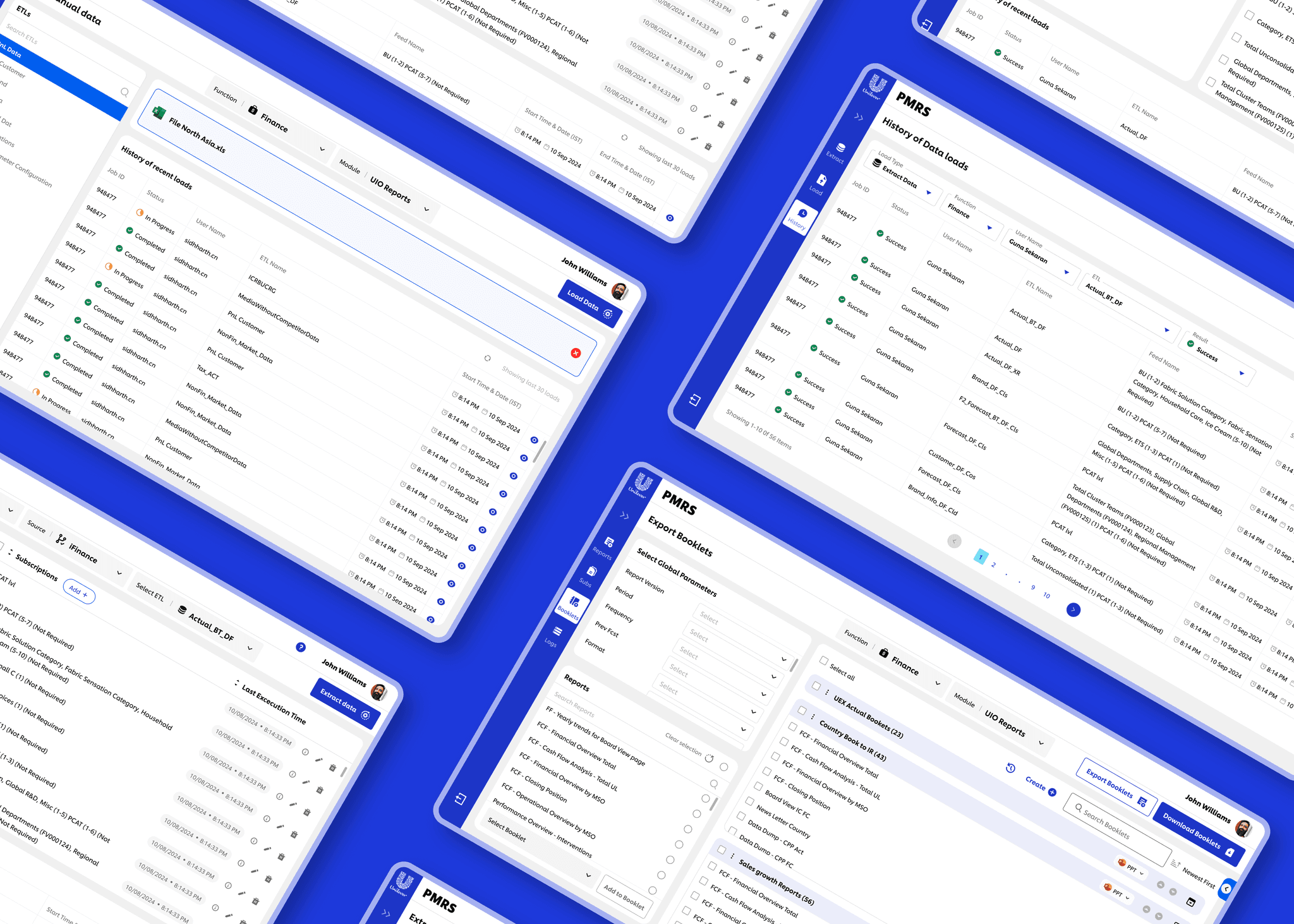
wireframes & High-Fidelity UI Designs
Following the completion of user flows and information architecture, I transitioned into wireframes and high-fidelity UI designs executed in a sprint-by-sprint approach. The design work was structured around the two major workflows of the application: Data Load and Report Generation.
Sprint Planning & Task Breakdown
Each sprint focused on one module at a time. This approach ensured modular focus, clear accountability, and smooth collaboration between design, product, and development teams.
User stories were created for each module (e.g., Manual Data Upload, Report Export).
Design tasks were defined within each story to cover specific features and screens(e.g., validation state, loading state, data extract view).
Started with Data Load (manual upload, data extract), followed by Report Generation (single export, booklet, and subscription export)
Wireframes
Before jumping into high-fidelity design, I invested time in exploring design concepts for each module. These concepts acted as a bridge between strategy and execution.The goal was to explore, experiment, and validate multiple design possibilities before committing to pixel-perfect UIs.
Iterative Process
Shared initial low-fidelity wireframes with product managers and team.
Gathered early feedback on navigation clarity, export flow logic, and screen hierarchy.
Refined layouts to reduce interaction cost and improve information findability.

High-Fidelity UI Designs
Focus on UI DESIGN
Prototypes were created to simulate end-to-end workflows.
These were used in stakeholder demos and final validation with users, helping to showcase not just visuals, but behavior and logic.
Integrated micro-interactions and realistic states to make the interface intuitive (e.g., loading states, error alerts, field-level validations)
Initial design reviews with the product team
Gather early feedback to fine-tune the interface, microinteractions, and user flow logic
Identify any technical or functional constraints before stakeholder presentation
Validate that the UI accurately reflected agreed-upon workflows and requirements
These collaborative reviews ensured that the UI wasn't just visually complete, but also aligned strategically and ready for final sign-off.
Final review and approval with business stakeholders
Walkthroughs conducted with data load and report generation team leads.
Achieved sign-off after validating how the screens addressed pain points like reduced navigation effort and improved report delivery options.
Strengthened stakeholder confidence through responsive iterations.


Design Validation
Outcome
Addressed final usability concerns before implementation.
Created a design that was validated by the people who would use it daily ensuring real-world relevance and usability.
This validation step ensured the final design was not just approved in theory but proven in practice, directly by the users who rely on it daily.
Handoff & Collaboration
KEY ITEMS discussed

Streamlined IA
As part of the redesign, I restructured the application's Information Architecture to address major usability flaws in the legacy system. The new IA was domain-specific, workflow-driven, and focused on reducing interaction cost. It enabled users to easily switch between domains, locate core workflows, and complete tasks with fewer steps. The new structure supported progressive onboarding, better feature discoverability, and long-term scalability all while aligning with business logic and user expectations.


Guided Product Tour for New Users
To support first-time users and reduce the steep learning curve of the previous system, a guided product tour has been integrated into the redesigned application.
Step-by-step walkthrough of key modules: Data Load, Reports, and Export functions. Highlights essential features, explains their purpose, and shows how to interact with them.

Modular & Domain-Aware Architecture
A unified interface with a persistent domain switcher (Finance, Market, Supply Chain), Role-based dashboards with domain-relevant KPIs, tasks, and reports.

Innovative & Flexible way to Report Export
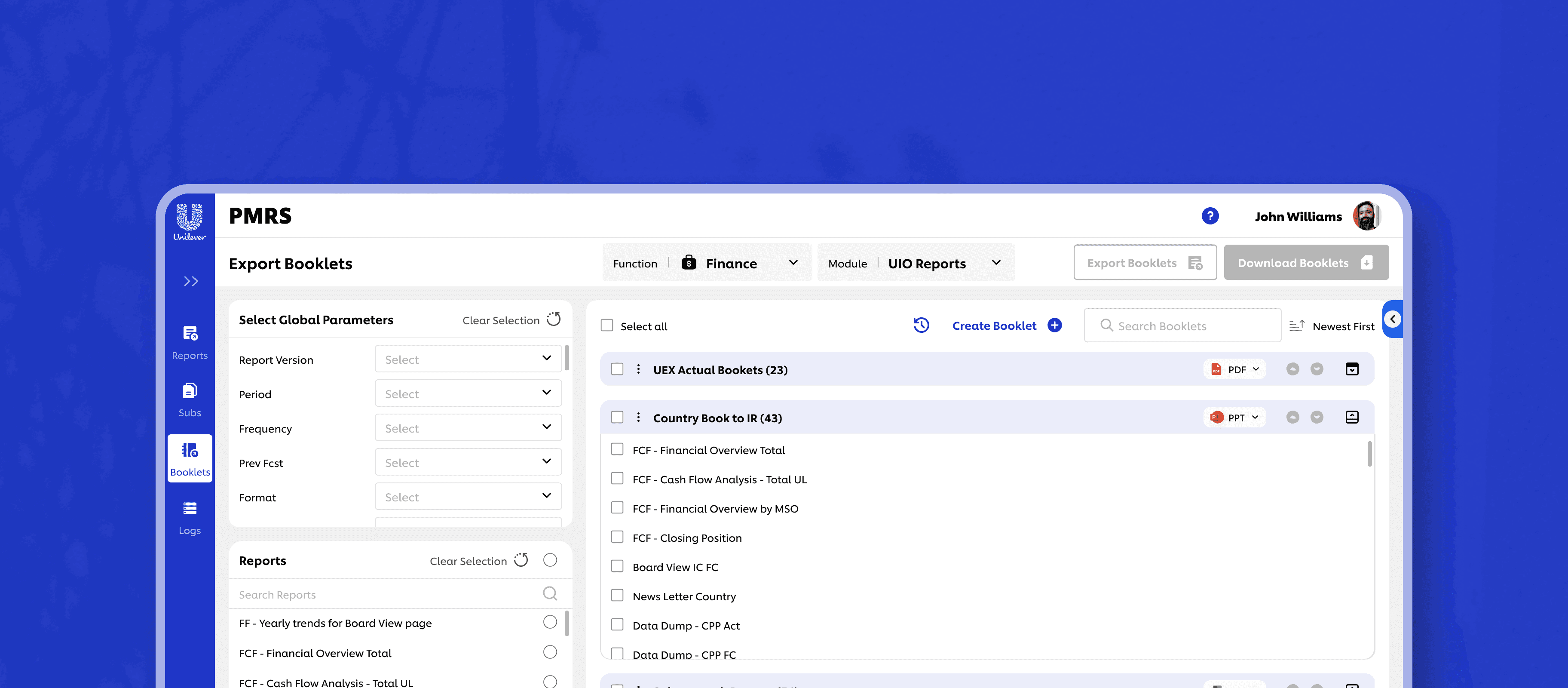
One of the core improvements introduced is a flexible report exporting system that gives users control over how they access and share information. Users can now export reports in three intuitive ways.
Single Report Export – Quickly download individual reports on demand.Booklet Export – Combine multiple related reports into a consolidated, well-structured document. Subscription Export – A lightweight, personalized export method that allows users to select frequently used reports and export them together as a reusable bundle
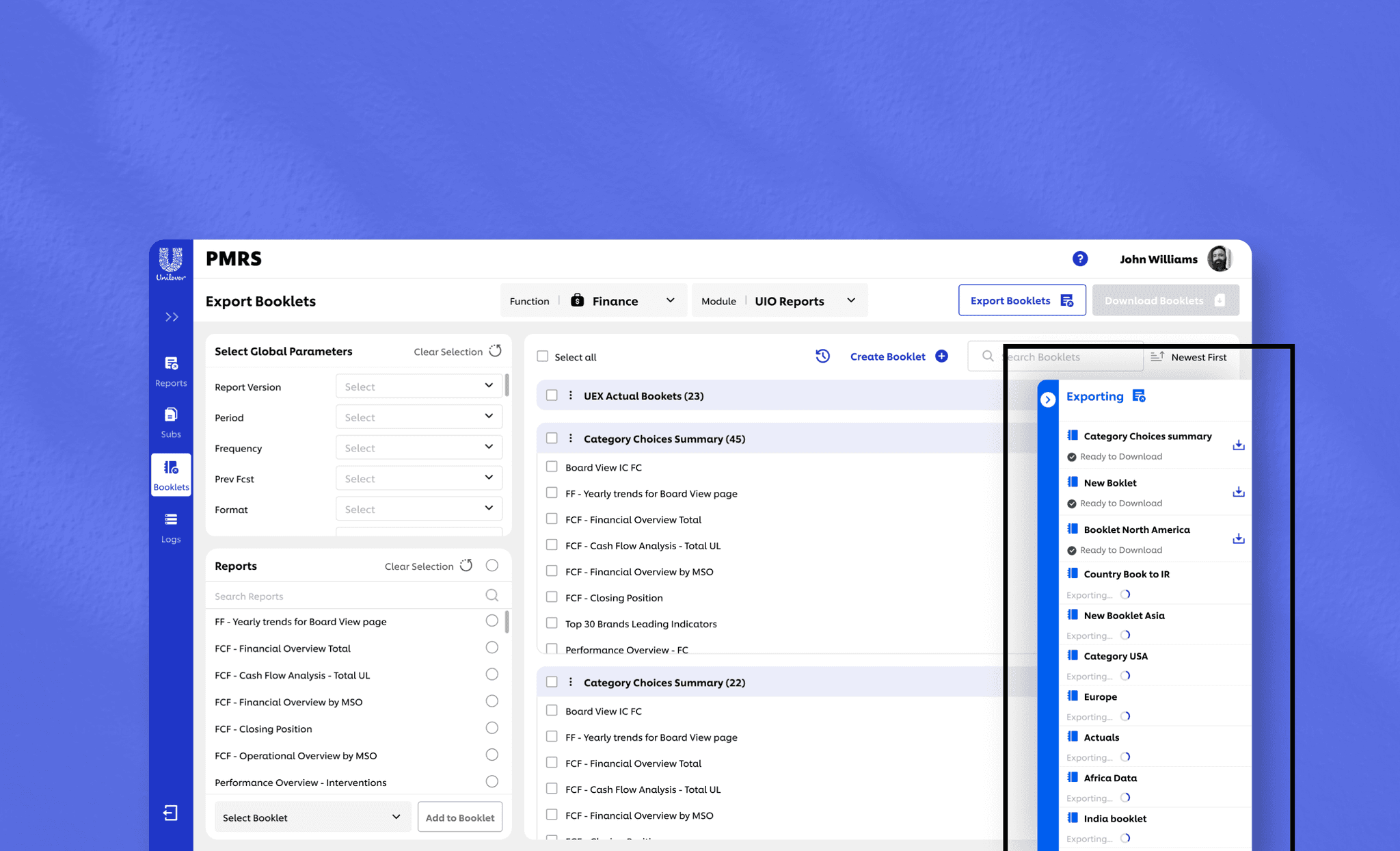
In page Export functionality
Designed a solution that enables users to export reports asynchronously, allowing them to initiate multiple report generations without waiting for each export to complete. Also allows users to work on other stuffs parallell`y. This parallel workflow significantly improves efficiency for the report generation team.

Enabling Data Extract

Proper Error Handling
Handled errors in such a way that users can easily recover from them. Provide clear error messages and allow users to recover easily from mistakes.

Proper System Feedback
Use of toasts, snackbars, and loading indicators for every key action. Success messages with next-step suggestions, A notification center showing status of tasks (upload complete, report queued, etc.)

Modern UI with Consistent Components
Designed with modern UI compoents for responsiveness and clarity, which reduced reduced visual clutter, added consistency and interaction steps with clean layouts.

Brand Coherence
Designed the tool with all the required brand guideline which ensures that your brand's visual language is consistently applied across all digital touchpoints, promoting a strong and coherent brand presence.

Making things accessible
I designed the entire application considering the basic accessibility checks and made sure it is accessible across all user groups by checking things like, color contrasts, headings structures and labels, form field labels, proper links and buttons, tooltips, indicating required fields etc.