Scaling Innovation Business Planning (IBP) Process for Unilever Across North America
User Experience
Research
User Interface
Concepts
User Interviews
Design Systems
Testing
Design Mgmnt
Design Strategy
Time line
Nov '22 - May '23
Team
1 Designer(myself) , 3 Developers,
2 Data analysts,
1 Business Analyst, 1 Product Owner.
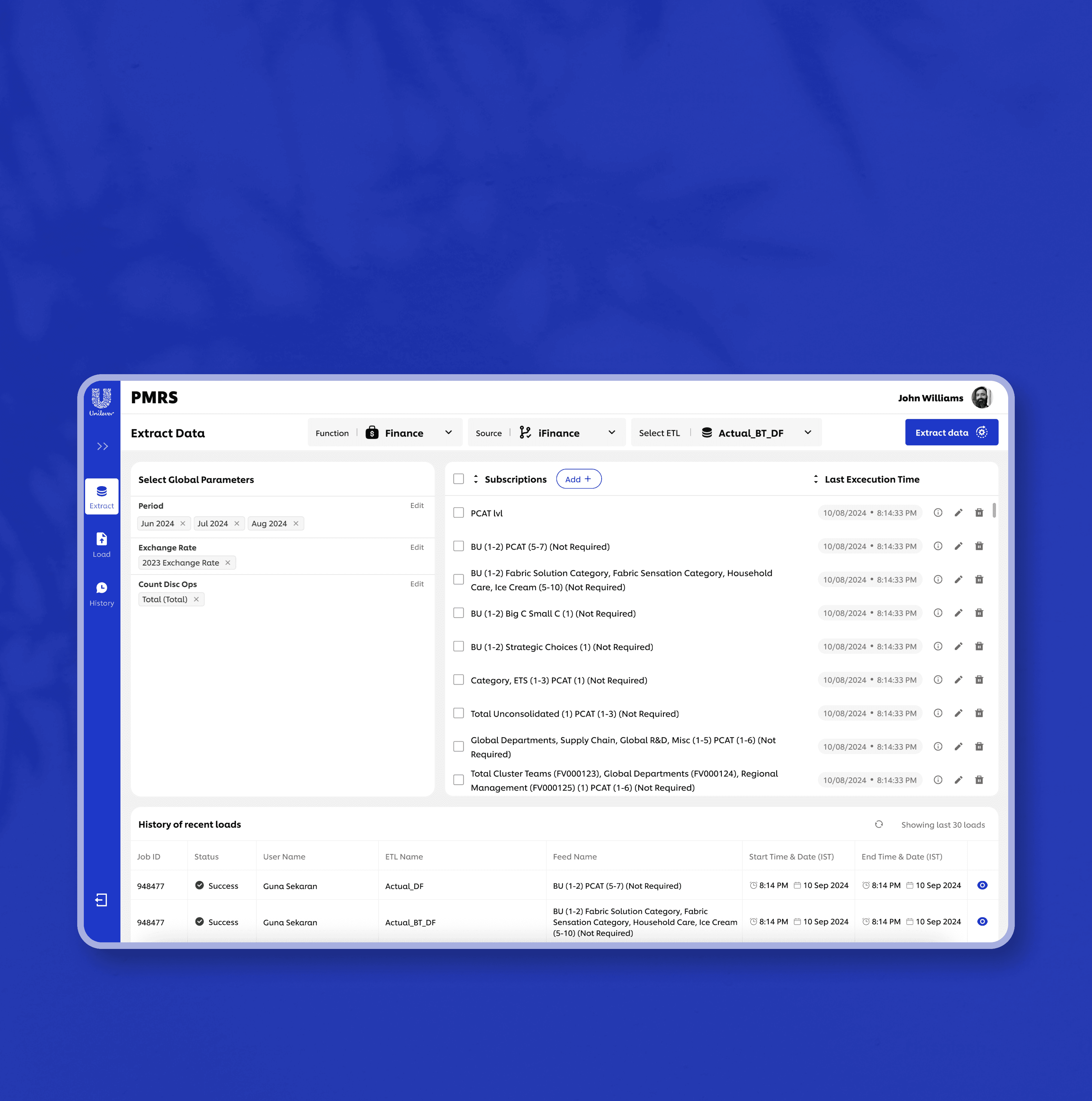
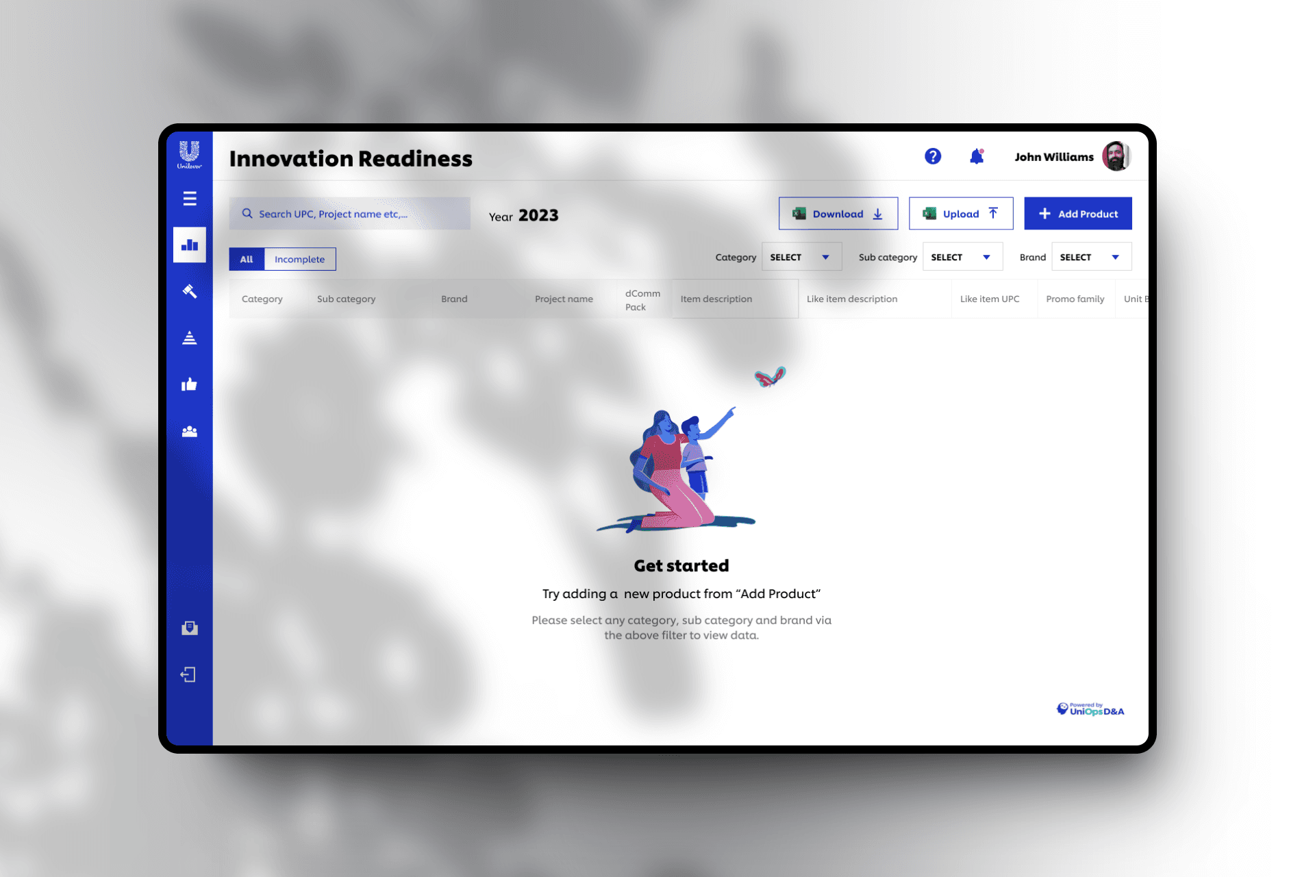
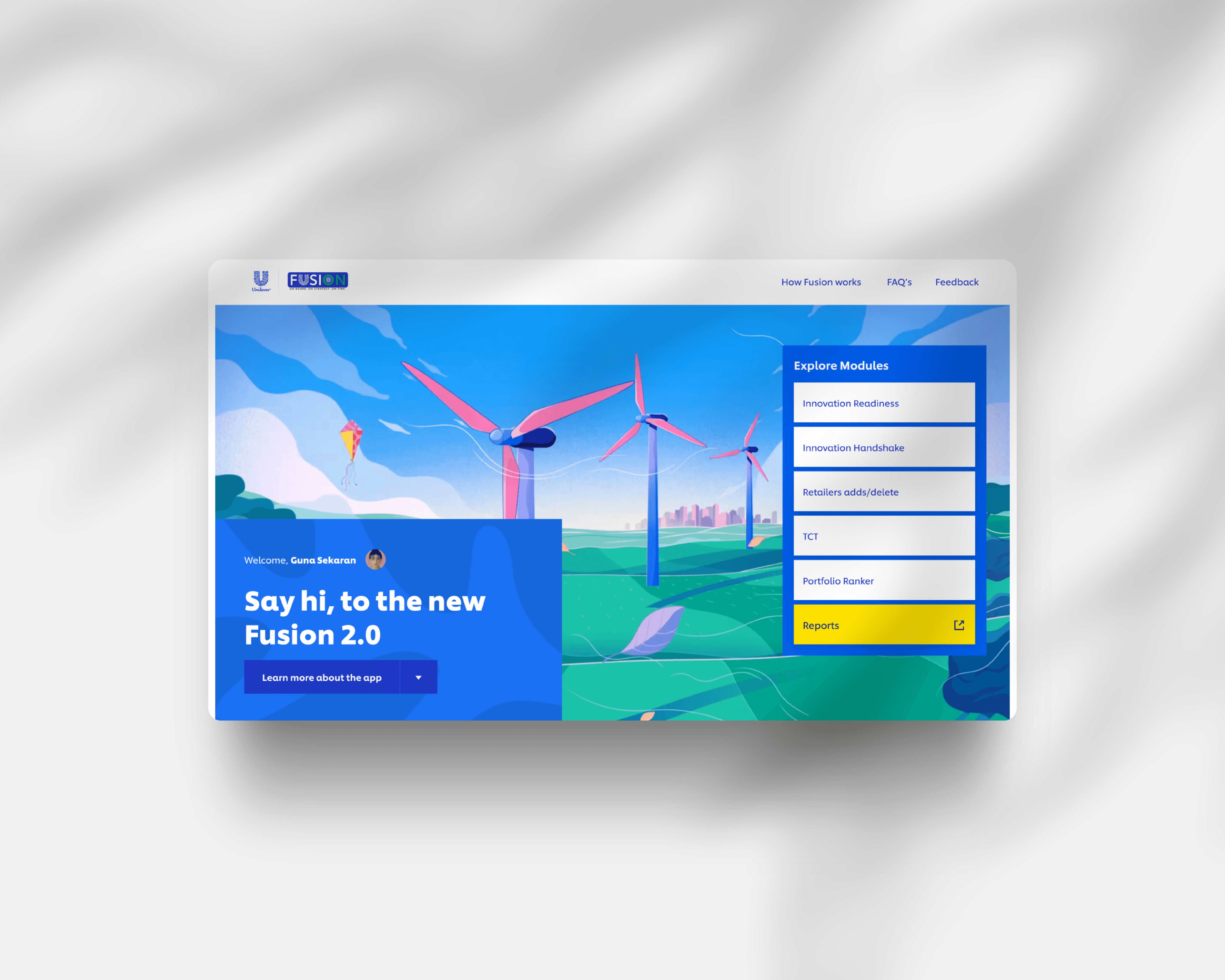
Fusion is a WebApp based control tower that drives accountability and discipline by tracking deliverables vs plans across multiple processes in the Innovation Planning (IBP) cycle.
This project involves redesigning and rebuilding an existing Power App into a scalable web application.
outcomes
3X
Improved Business
This impacted the overall business success and improved the efficiency by the faster report generation practices.
8000
hrs
Human efforts are saved every year
The new design saved huge amount of unwanted time spent when completing the tasks for the entire team comprising between 8-13 people.
95%
User satisfaction reported
Post design usability study reported that users enjoys using the new application with the new design providing very few feedbacks.
my role
Led the project end-to-end from a design perspective overseeing user research, discovery, design strategy, detailed breakdowns, design excecutions and stakeholder management.
Problem
BUSINESS GOALS
Empower teams to quickly understand and adopt IBP process by designing a clear, intuitive, and welcoming onboarding experience that reduces confusion and encourages active use from day one.
Transform & Modernise
Transform the current tool which is in a power app to web app for faster access and to bring improvement in-terms of User experience and to modernise the tool.
Fasten the tracking
Find a solution to streamline and redesign to build a web app that helps users to do quicker tracking process. Which also improves better user engagement.
Build a scalable, future-ready system |
Support large datasets efficiently with a responsive and optimized design. Scale across geographies, enabling consistent usage across multiple business units in the USA and Canada.
Challenges faced
The project posed several challenges across product complexity, user needs, and collaboration dynamics. As the sole designer, I encountered both strategic and operational hurdles while driving this transformation from a Power App to a scalable web platform.
Collaboration Challenge
Working across different teams (product, business, and engineering) required aligning varied priorities, managing communication gaps, and translating technical limitations into feasible design ideas.
Conducting Research
Conducting remote user interviews across the US and Canada was a challenge — especially in accommodating time zones, aligning questions to different roles, and ensuring unbiased insights.
Process and Business
The internal business process was layered and domain-specific. It took time and effort to fully understand the end-to-end process and translate it into intuitive user flows and simplified task structures.
Viewing - 1 / 4
KEY ITEMS discussed
We Set deadlines and milestones.
what are the key KPI's that need to be achieved along the way?
Identify any constraints or limitations legal or other constraints that will impact the project's goals or objectives?
Connected with people from various tech fronts to understand the technologies that are used and had a ice breaker session with the cross functional team on planning for collaboration.


Viewing - 2 / 4
Actual end Users


Primary Users
They are the brand managers from various teams from the regions of North America that includes countries like USA & Canada.
Secondary Users
They are the senior managers of those brands who monitor the products or brand's performance by generating reports.
4800+
Geography
USA & Canada
65%
Male
35%
Female
0%
Others
19.10% (25-34yrs)
30.30% (35-44yrs)
44.70% (45-54yrs)
5.90% (54-64yrs)
User Interviews
User Interviews were conducted in a moderated way via the video calls, asking the users to answer the set of questions that we prepared.
Interview Context
Remote interviews via video calls
60-90 Minutes per participants
20
User Personas
David Chen

Key Takeaways
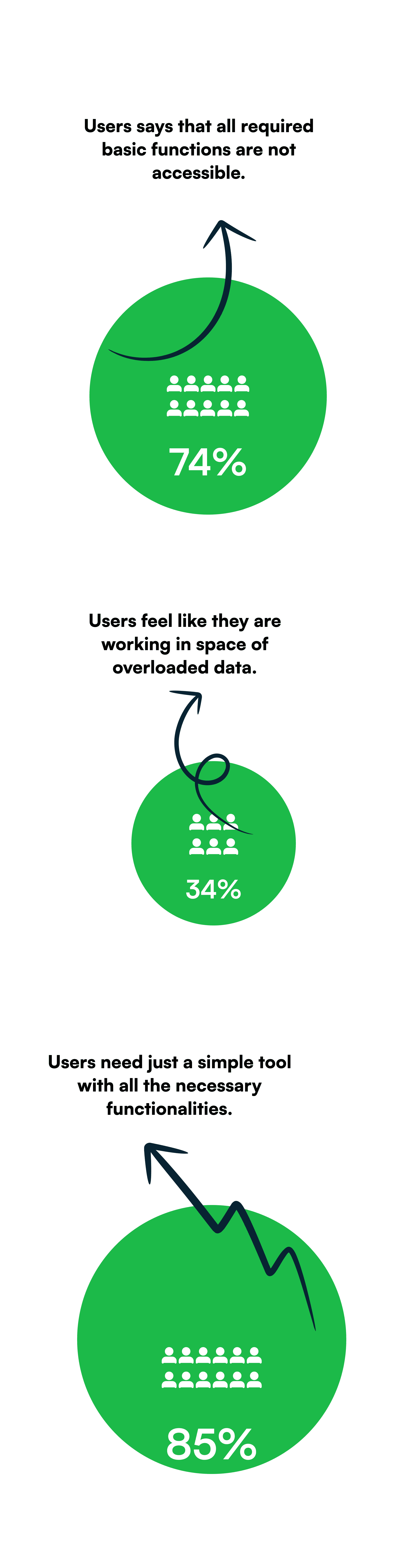
Manual dependencies create inefficiencies
Critical steps like report sharing and team updates still depend on external tools like Excel and email, increasing turnaround time.
Performance is critical
Users report slowness and system lags, which will worsen as data and user base scale.
Data is fragmented and poorly structured
This leads to inefficiencies in filtering, sorting, and retrieving insights at scale.
Navigation is confusing and unintuitive
Users feel lost when switching between modules and brands due to poor IA and lack of structure.
Users are overwhelmed with information
Interfaces show too much raw data without prioritization, increasing cognitive load.
New users are especially frustrated
There is no onboarding, contextual help, or clarity about what to do next.
Lack of consistency and visual clarity
Inconsistent UI elements, unclear labels, and weak visual hierarchy make even simple actions feel heavy.
Users want a modern, unified experience
They desire a professional-grade platform with seamless flow, built-in intelligence, and automated features.
Viewing - 3 / 4
Framing the Right Problems – HMW Statements
How might we reduce data overload and help users focus only on relevant entries?
How might we improve task clarity and navigation across the five modules?
How might we replace external communication with in-app collaboration?
How might we ensure the tool can scale while maintaining usability and performance?
How might we make the onboarding process more intuitive for new users?
DESIGN goals
01
Guide new users with onboarding and inline assistance.
02
Minimize cognitive load through visual hierarchy, filtering, and contextual layouts.
03
Support scale by designing for 450,000+ products and users across USA and Canada.
04
Reduce user friction by simplifying workflows and enabling automation.
05
Ensure performance tracking is structured, insightful, and actionable
06
Enable consistent reporting and communication between brand managers and leadership.
07
Ensure inclusivity by designing a product that works for diverse user roles, regions, and contexts
08
Establish UI consistency using reusable patterns and a component-based approach
Collaborative Inputs
Viewing - 4 / 4
User flows


WIREFRAMES


UI Design approach
Interaction and prototyping


Following users mental model

Defining Proper Information Architecture
Improved content discoverability. Reduced cognitive load by organising the content meaningfully. Created a scalable navigation framework for future growth.

Providing Visibility of system statuses
To build trust and reduce user frustration, I focused on making system feedback more immediate, clear, and contextual. During initial user testing, many participants expressed confusion about whether their actions (like saving data, uploading files, or applying filters) had succeeded, often resulting in repeated actions or abandonment.
Reduced Interaction Cost
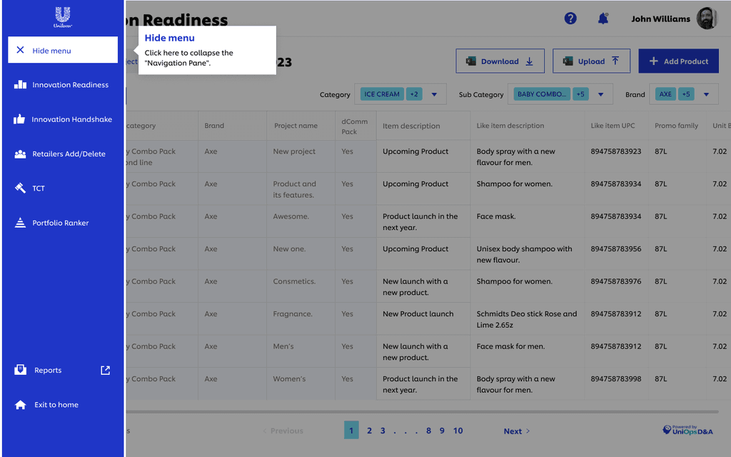
Enabling Inline table edits, simplified task flows and batch actions like bulk product upload functions. These improvements made the experience feel more fluid and less mentally taxing.

Proper Error Prevention
Optimised error handling across the workflows by clear labels & input constraints, inline error messaging, confirmation dialogs for irreversible actions, disabled states & progressive disclosure.

Improved filtering options
Introduced cutting-edge filter options with superior capabilities allowing the users to pinpoint and find the suitable product from an array of 1000's of items they own. By adding search, filters and segment control conponents.

Real time collaboration
Enabled transparency on every changes by adding comment feature for every item, enabling customers to engage and seek insight from the community to clear up uncertainties. This led to a decrease in unproductive time spent in debates.

Organised Layout
Enables quick scanning and ensured visual hierarchy through the overall structure.
Demo and Support
In app interactive guides for new users, guiding them across the application and also providing proper support documents and links guide users for quicker learnability.

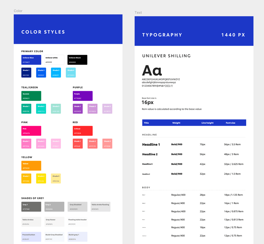
Minimal level Design Systems & Comps
This enabled us to achieve uniformity throughout the software, thereby enriching the users' comprehension of its features. This enabled consistency and standards across the entire application. Simultaneously, it facilitated the creation of a component library that can be utilized across the array of tools developed by the same D&A team. Which also resulted in better handoff which when applied to the designs of for many other applications also.
Brand Coherence

Making things accessible
I designed the entire application considering the basic accessibility checks and made sure it is accessible across all user groups by checking things like, color contrasts, headings structures and labels, form field labels, proper links and buttons, tooltips, indicating required fields etc.