I led the end-to-end UI/UX design for this initiative, handling everything from research and competitive benchmarking to the user experience strategy and design.
Timeline
Sep '21 - Nov '21
Skills
User Experience
Research
Concepts
Concepts
Interfacce Design
My role
UI/UX Designer
Team
1 Designer (Myself), 3 Developers,
2 Data Engineers,
1 Business Analyst, 1 Product Owner,
1 System Architect.
The Overview
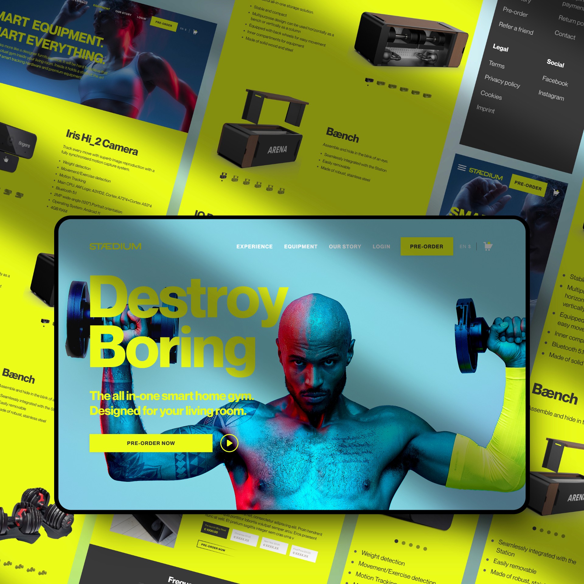
What's Stædium?
New age fitness product
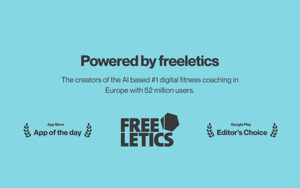
Stædium is a subsidiary brand of Europe's largest fitness brand, Freeletics. They are one of the pioneers in the fitness industry, gearing up for the launch of their new fitness products moving from digital platform to selling real time fitness products under Stædium.
Our Mission
To revolutionize the way people experience strength training in an immersive and enjoyable way.

Business Goal
Key Metrics
Create a compelling and enjoyable experience that reflects the unique Stædium style.
Drive conversions through an intuitive shopping flow and clear communication
Strategize and create impact through design that connects with target user
Differentiate the brand through unique visuals and immersive user experience.
Challanges
Cultural diversity & Localization
Europe has a diverse range of cultures, languages, and preferences, making it challenging to create a design that resonates universally across different regions. Adapting the website for multiple languages and regional variations, including currency, measurement units, and local regulations, is crucial for a seamless user experience.
Brand Differentiation
The fitness market is highly competitive, so the design must effectively communicate the brand's unique identity while standing out among numerous other fitness brands.
Collaboration is the key
Here I was supposed to collaborate with teams from 2 different time zones. I had to get in touch with the stake holders, marketing and content team from European time zone and as well with developers from Indian time zone.
Short timeframe
Being an alone designer, getting this done in a shorter frame of time is not an easier task. The actual time frame given for design was not more than 3 weeks.
Secondary research & competitive analysis
To do a clear secondary research about the fitness brand and its product and also to conduct a competitive analysis.
Design Process
User Research
Since this was a pre-launch initiative with limited access to real users, our research strategy primarily centered around competitive benchmarking and market scanning to gain directional insights and identify opportunities to stand out.
Research Goal
Understand how leading fitness brands structure their eCommerce experiences.
Identify trends, strengths, and gaps in competitor offerings.
Extract inspiration for crafting a brand-forward and conversion-friendly experience.
Uncover experiential cues that could help Stædium differentiate itself.
About the users

Competeitor Analysis
Subsequently, I conducted a competitor analysis to identify the rivals of the brand I am developing for. This allowed me to grasp the advantages and disadvantages of competing products and understand how their features resonate with users. Based on this, I implemented the successful elements from competitors while avoiding the drawbacks.

Key Takeaways
Clarity + Immersion
Streamlined Checkout
Community & Motivation
Mobile Optimization
Emotion over specs
Ideation phase
The ideation phase was shaped by research-driven insights, business goals, and a bold mission to reshape how strength training is experienced. With limited direct user research, we focused on designing strategically through pattern analysis, emotional storytelling, and conversion-focused ideas that reflect the brand’s disruptive spirit.
Ideation Goals
Translate research and brand vision into impactful UX concepts
Create a differentiated digital experience within a competitive fitness market
Establish user trust, emotional resonance, and frictionless buying journeys
Strategize for visibility, adoption, and pre-launch momentum
Design Decision
Core Experience ideas
Lack of emotion in competitor sites.
Flat product presentation
Low trust for new product
Friction in purchasing flow
Poor mobile UX in the market
No visibility pre-launch
Overloaded product detail page
Design Strategy Themes
Story-First Experience
Trust Through People
Visual Boldness + Consistency
Conversion Through Clarity
Information Architecture
As part of transforming research insights into structured UX, I led the effort to define the site architecture for Stædium’s eCommerce platform. The goal was to organize content in a way that supports both product discoverability and brand storytelling, while maintaining clarity across user journeys.
Key Considerations
Users needed to understand the product quickly including specs, benefits, and use cases.
The product page would carry a high content load, requiring a modular, progressive disclosure structure.
The site needed to support early community and brand-building efforts not just sales.
Navigation had to be minimal but intentional, ensuring speed and simplicity.
Outcome
The sitemap laid the groundwork for a clean and intuitive experience that’s future-ready, mobile-first, and designed to convert. By mapping the core content categories, we ensured every page had a clear purpose, supported business goals, and aligned with what users needed most at each stage of their journey.

Glimpse of UX Process
Final Designs and Implementations

Strategic Pre-Launch Pricing Mechanism
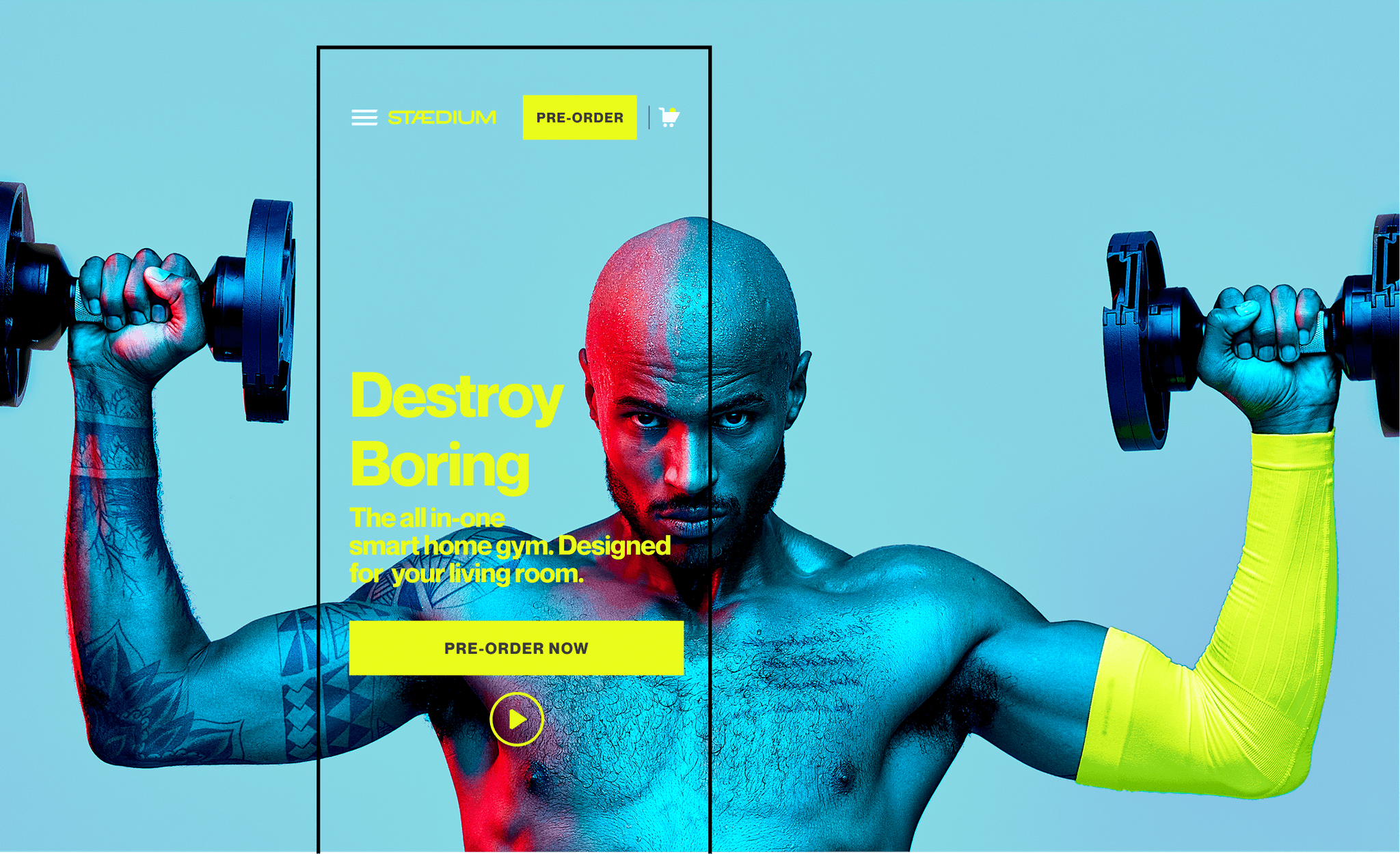
Implemented a dynamic pricing model that increased gradually leading up to launch, with the final price set at $1999. Created a landing experience with countdowns, urgency cues, and lead collection. This approach turned pricing into a psychological driver for action.
Outcome: Thousands of pre-orders were secured before launch, validating the product’s desirability and proving early traction.

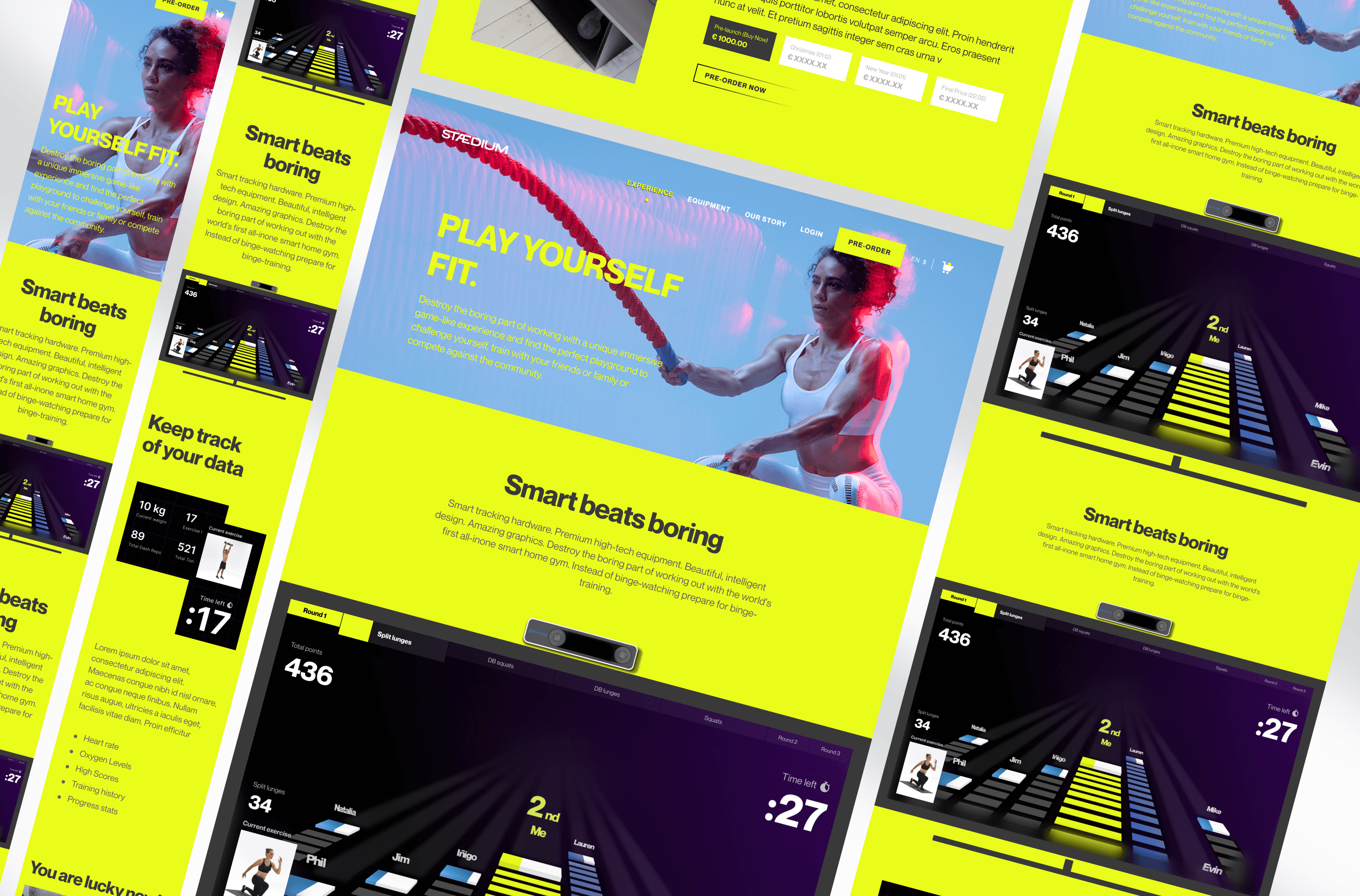
Simplified Yet Powerful Product Page
Prioritized the product detail page experience, knowing it had to carry dense information without overwhelming the user. Used expandable sections, quick-scan highlights, visual feature callouts, and comparison grids. Included modules for FAQs, testimonials, compatible accessories, and tech specs all arranged for progressive disclosure.
Outcome: Users could quickly absorb key benefits, reducing cognitive load and decision fatigue.
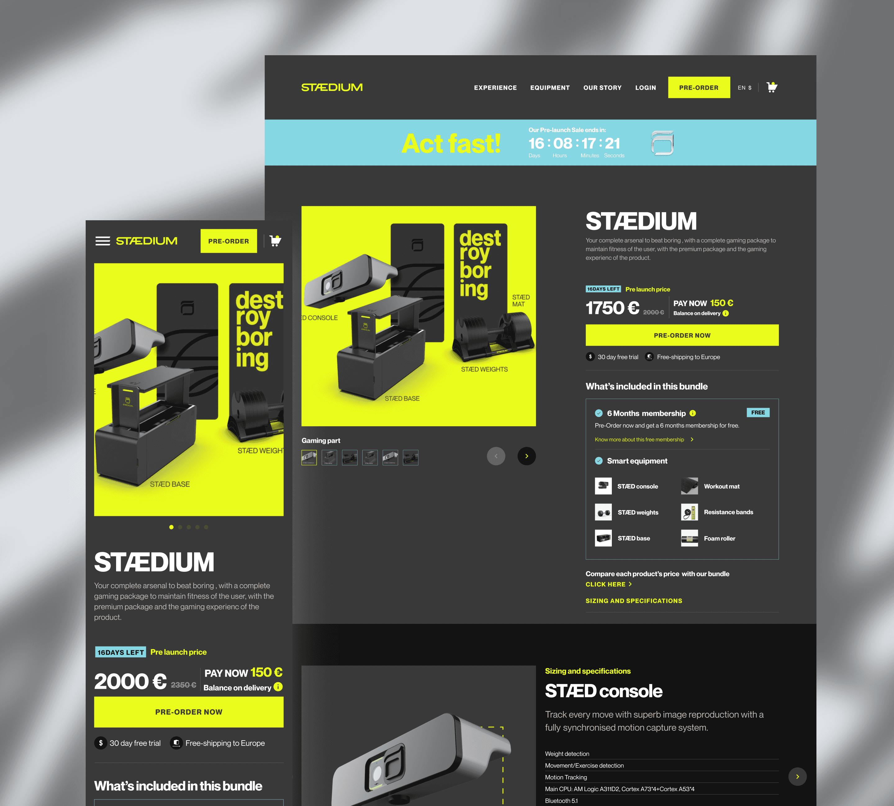
Building Trust
Integrated authentic testimonials from early users and athletes to build emotional credibility and reduce hesitation. Highlighted the legacy and authority of Freeletics Europe’s leading fitness brand as the foundation behind Stædium. Positioned Stædium not as a new brand, but as a trusted evolution of an already well-established fitness ecosystem.
Outcome: Helped users trust the product early by leveraging real voices and the strong reputation of Freeletics.

User Motivation Through Emotional & Behavioral Design
To encourage users to take action especially during the pre-launch phase I strategically designed moments of motivation and momentum throughout the experience.
Outcome: Increased emotional connection, stronger user intent, and a higher likelihood of conversions and pre-orders.

Reusable Multi-Use Components for Scalable Design
To maintain consistency, speed up development, and ensure scalability, I implemented a set of reusable, multi-use components across the platform. These included cards, banners, testimonial blocks, icon-label rows, CTAs, and more designed to flexibly adapt across various pages and devices.
Outcome: Faster design iterations, smoother handoffs to development, and a scalable foundation for future product pages and content expansion.

Mobile-First Navigation & Conversion Path
Crafted gesture-friendly navigation with sticky CTAs and thumb-friendly interactions. Streamlined the checkout process with minimal distractions, persistent cart access, and smart defaults. Optimized every interaction flow for speed and simplicity across screen sizes.
Outcome: Improved usability for the core mobile-first audience, increasing the likelihood of completing purchases.

Impact
Some numbers for context
500+
Orders Places pre-launch
$500k
Revenue generated in pre sales
70%
Overall Conversion Rates
What I learned
This project was more than building a shop it was about shaping a premium, trust-rich, emotionally engaging launch experience. From ideation to interaction, every decision was tied back to making the product believable, desirable, and differentiated in a competitive market.
Strategic UX = Business Impact
Storytelling is a Conversion Tool
Less Can Be More (When Structured Right):
Working with Constraints Enhances Creativity:


Watch the full product launch