I led the entire end-to-end design process from research and strategy to execution, ensuring the solution aligned with business goals and user needs. As both a designer and researcher, I conducted user research, synthesized insights, and translated them into hands-on deliverables.
Timeline
May '24 - Sep '24
Skills
User Experience
Research
User Interviews
Concepts
UX Strategy
Concepts
Interfacce Design
My role
Design Lead
Team
1 Designer (Myself), 3 Developers,
2 Data Engineers,
1 Business Analyst, 1 Product Owner,
1 System Architect.

The Overview
What's PMRS?
One stop shop solution for data load and reporting operations.
Performance Management Reporting System (PMRS) is a global data load and reporting platform primarily used by the Data Load and Report Generation teams. It supports reporting activities across Finance, Supply Chain, and Market domains all of which rely heavily on the reports generated through this system to make informed business decisions. The tool is accessed by teams worldwide and plays a vital role in day-to-day operations and strategic reporting cycles.
Why - The Problem?
The existing system was over a decade old, difficult to use, and fragmented across domains. Users spent unnecessary time navigating between multiple links and repeating manual tasks, especially during peak business cycles. This not only slowed down processes but delayed the delivery of insights essential for executive decision-making. A redesign was essential not just to modernize the UI, but to realign the tool with current user needs and business goals.
Some numbers for context
45%
Longer Task Completion Times
60%
Slow onboarding for new team members
65%
support tickets tied to user experience issues
Business Goal
Modernize and make it User friendly, Scalable and Cost effective.
Key Metrics
Streamline reporting and data workflows to meet operational timelines.
Reduce manual workload and errors through smart UX.
Enable faster decision-making by ensuring timely delivery of critical reports.
Improve adoption and reduce onboarding time for global teams.

Discovery & Ideation
User Research
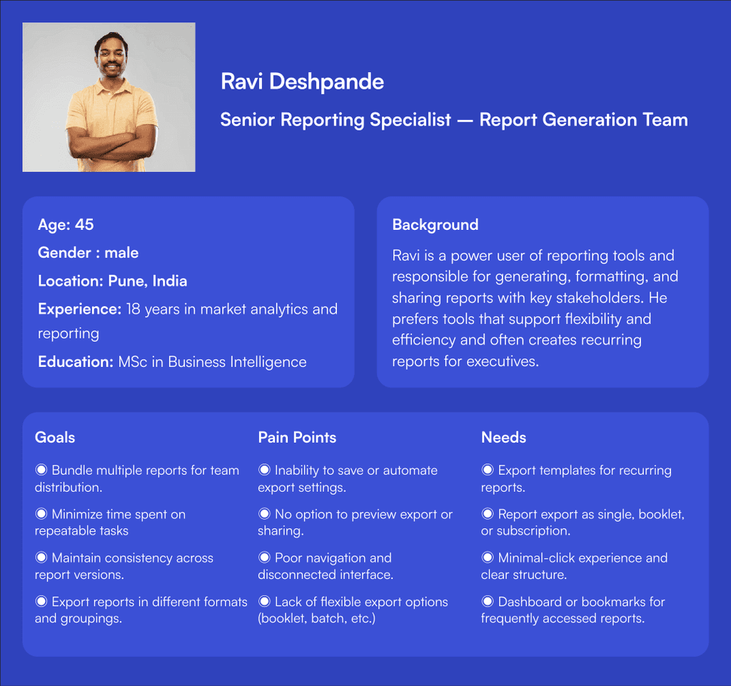
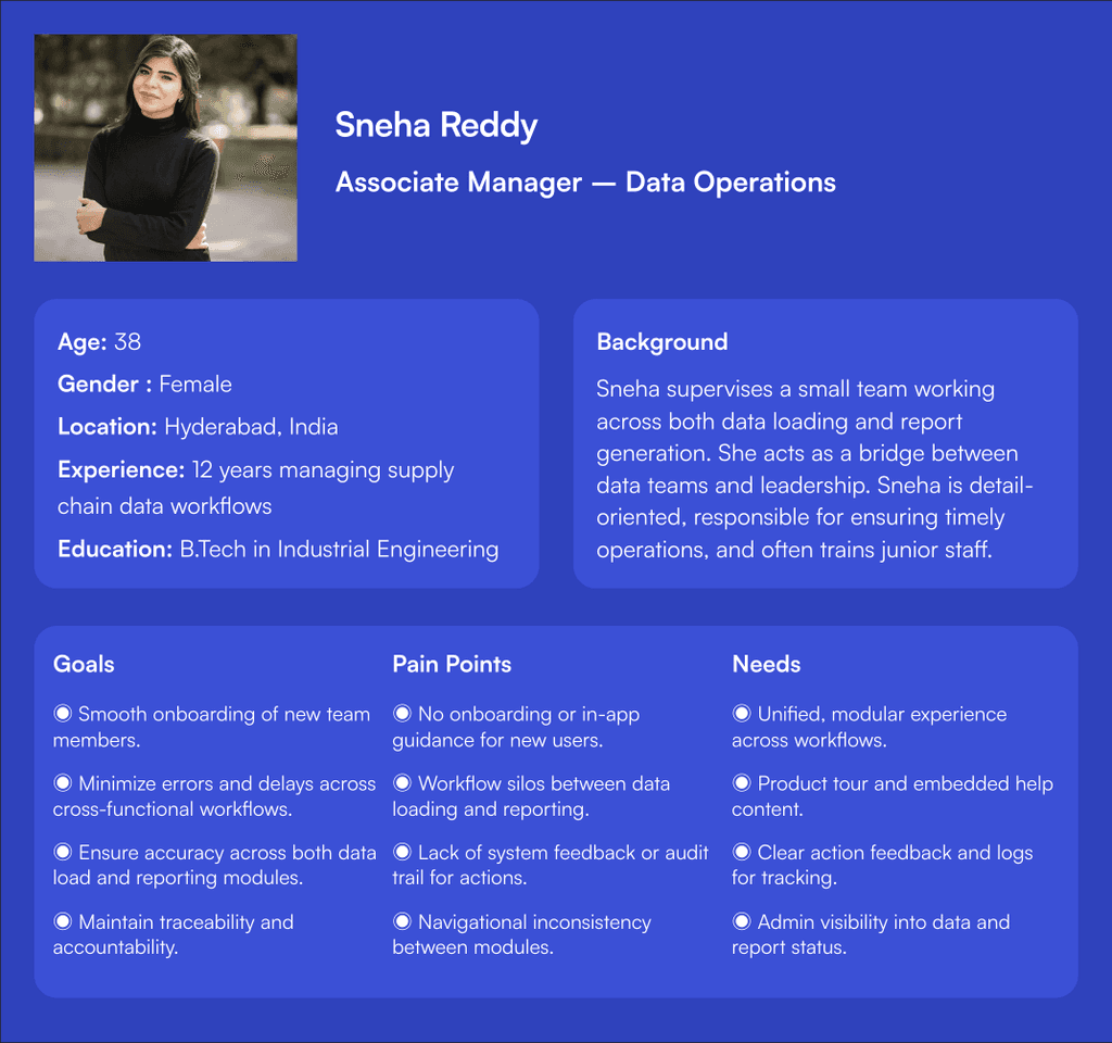
To better understand user challenges and uncover pain points, user interviews were conducted with enterprise users in India, representing both the data load and report generation teams.
Actual end Users
Data Load Team
They are the team who loads the data from various sources for the purpose of report generation.
Reports Genenration Team
They are the team that generates customised reports based on the requirements.
Total Users
1400+
Geography
Majorly from India, Few Globally.
Gender Distribution
75%
Male
25%
Female
0%
Others
"Why I Prioritized User Interviews Over Heuristic Analysis"
About
the User interview
To better understand user frustrations and uncover improvement opportunities, I conducted targeted user interviews with members of the Data Load and Report Generation teams across the Finance, Market, and Supply Chain domains. Although the user base is global, these sessions focused on users based in India to gain localized insights.
Interview context
Method
Remote Interviews via video call
Regions Covered
India
Total Users
1400+
Duration
45-60
Minutes per participants
User Involved in interviews
7

What we learned
From the user research
80%
New Users feels that they are completely lost when using it for the first time.
90%
Users say like the interface is outdated and lacks user friendliness.
83%
It takes too many clicks to complete even a simple task
Major Issues to address
Steep Learning Curve Is a Major Barrier
Users, especially new ones, struggle to get started without peer support. There’s no guided onboarding, tooltips, or helpful prompts. This results in dependency, wasted time, and slow adoption.
Fragmented access casuing poor Navigation & Confusing IA
Users face inefficient navigation due to separate URLs or entry points for each domain & modules forcing a disconnected experience. This leads to excessive back-and-forth & higher interaction cost.
Workflows Are Rigid, Time-Consuming, and Error-Prone
Both data load and report generation involve high interaction cost. There’s no undo, no validation, and users must restart entire workflows on failure.
System Feedback and Error Handling Are Practically Non-existent
Users often receive no confirmation or ambiguous error messages. This leads to trial-and-error behavior, frustration, and loss of trust.
Accessibility and Inclusivity Are Ignored
Users face strain due to small fonts, lack of dark mode, and no language support. The interface is not friendly to differently-abled users or regional diversity..
UI Design is Outdated and Unintuitive
Users perceive the system as old and clunky, lacking visual cues or modern design patterns. This negatively affects user satisfaction and motivation to use the system.
Ideation phase
To convert research insights into actionable solutions, we facilitated a focused ideation workshop with cross-functional stakeholders. The goal was to collaboratively explore ideas that would improve usability, reduce interaction costs, and better support the data load and report generation workflows. And to validate early ideas and to avoid technical misalignment. And also to discuss on the key features for this release.
Participants involved
UX Designer (myself) - Led the ideation and synthesized user research.
Product Owner - Provided business constraints and goals
Front-End Developers - Ensured technical feasibility.
Stakeholders - played a key role in reviewing ideas, validating directions, and aligning solutions with broader business objectives.
Design decision
Every design decision in this project was guided by a strong foundation of user research, stakeholder input, and the need to align with business goals. The goal was not just to modernize the interface, but to create a system that would improve efficiency, reduce user frustration, and support critical reporting workflows across global teams.
criteria for evaluating ideas
Feasibility with current tech stack
Alignment with user pain points and research findings
Scalability across global teams.
Impact on reducing time, errors, and friction.
Business relevance to month-end reporting.
Examples of Incorporating Research Insights
"For example, I chose to introduce different levels of report exports after mapping common user needs some needed quick reports, others needed bundled outputs for sharing. This was not guesswork `it was a direct response to how users worked, simplified into a flexible UI experience."
Too many manual steps → inspired automated data extraction options
Lack of export flexibility → led to Single, Booklet & Subscription-based exports
Onboarding challenges → drove the product tour implementation
Key Design Decisions
Navigation & Architecture
Re-organize menus based on user goals rather than system structure. Use persistent navigation, icons, and color-coded domains to aid orientation.
Guided & Adaptive Onboarding
First-time user journeys with tooltips, task highlights, and video walkthroughs. “Start here” guided flows for both Data Load and Report Generation
Process driven instead of domain & module driven
To build the entire application from the point of process instead of domain. Just to bifurcate data-load and report- generation modules.
Data load experience
Simplify the entire process of this data load by implementing refined flows and reduced interactions. And by implementing better ways to load data.
Report generation experience
Implement innovative ways to generate report in addition to the existing ways. Enhance reporting with customizable and dynamic options.
Feedback and error handling
Inline success/error toasts. Error modals with "What went wrong & how to fix it. Clear messages like “Upload failed due to missing headers. View required format"
Inclusivity & accessibility
Enabling basic color contrasts, proper font scaling and proper labelling etc. Tooltips and descriptive ARIA labels.
Modern UI Enhancements
New modern visual design adapting to the brand guidelines of Unilever.
Design Excecution
Information Architecture
To design an IA that truly reflects user workflows and reduces friction, I followed a structured, research-informed approach.
How it was done
Grouped by Functional Roles, Not Just Domains
Used Noun + Verb-Based Labeling
For the Information Architecture, I followed a noun + verb approach using nouns for navigation labels (like Extract, Load, Reports) to clearly define sections, and verbs for actions and call-to-buttons (like Upload File, Extract Report, Load Report) to guide users on what they can do. This method helped create a clear distinction between where users are and what actions they can take, making the interface easier to understand and navigate.
Prioritized Key Actions & Visibility
High-impact tasks like “Export as Booklet” or “Extract Data” were surfaced more prominently to reduce interaction cost and minimize user effort.
Validated Through Iteration
The IA was reviewed with product teams and validated through feedback loops during wireframing and high-fidelity stages, ensuring alignment with real-world usage and terminology.

User Flows
As part of the early design strategy, I created user flows to visualize how users navigate through key workflows particularly Data Load and Report Generation across Finance, Market, and Supply Chain domains. These flows acted as blueprints for task completion and helped validate that the redesigned experience would align with real-world usage.
Before finalizing the flows, I conducted multiple working sessions with stakeholders. These discussions were crucial because:
It allowed us to align on the intended user journey early on, avoiding costly rework later.
Each business function had slightly different workflows, and these nuances needed to be captured and normalized where possible.
Stakeholders also helped identify edge cases, data dependencies, and compliance-related checkpoints that shaped the flow logic.

Wireframes
Following the completion of user flows and information architecture, I transitioned into wireframes and high-fidelity UI designs executed in a sprint-by-sprint approach. The design work was structured around the two major workflows of the application: Data Load and Report Generation.
Before jumping into high-fidelity design, I invested time in exploring design concepts for each module. These concepts acted as a bridge between strategy and execution.The goal was to explore, experiment, and validate multiple design possibilities before committing to pixel-perfect UIs.
It was an iterative process
Shared initial low-fidelity wireframes with product managers and team.
Gathered early feedback on navigation clarity, export flow logic, and screen hierarchy.
Refined layouts to reduce interaction cost and improve information findability.

High-Fidelity UI Designs
Once concepts were validated and aligned with product team, I transitioned into creating high-fidelity UI screens. These designs were built to reflect the final user experience, solve previously identified pain points, and support seamless implementation by the development team. The goal was to deliver designs at a story level within each sprint and secure sign-offs for each story from the stakeholders before moving to the next module.
Key things followed
Prototypes were created to simulate end-to-end workflows.
These were used in stakeholder demos and final validation with users, helping to showcase not just visuals, but behavior and logic.
Integrated micro-interactions and realistic states to make the interface intuitive (e.g., loading states, error alerts, field-level validations)
Identify any technical or functional constraints before stakeholder presentation.
Validate that the UI accurately reflected agreed-upon workflows and requirements.
These collaborative reviews ensured that the UI wasn't just visually complete, but also aligned strategically and ready for final sign-off.
Achieved sign-off after validating how the screens addressed pain points like reduced navigation effort and improved report delivery options.
Design Validation
After completing high-fidelity designs and securing sign-off from the product team and business stakeholders, we conducted final design validation sessions with real end users from the Data Load and Report Generation teams.
The goal was to ensure the new solution met real-world usability expectations before moving to development.
Outcome
Addressed final usability concerns before implementation.
Created a design that was validated by the people who would use it daily ensuring real-world relevance and usability.
This validation step ensured the final design was not just approved in theory but proven in practice, directly by the users who rely on it daily.
Handoff and Collaboration
Designs were documented and handed off to the engineering team using Figma.
Close Collaboration Ensured
Component reusability.
Dev-friendly interactions.
Shared understanding of constraints and edge cases.
The Solution
The difference we made
To address the significant usability issues across the existing application, a modular, user-centric redesign was proposed, focusing on simplifying workflows, reducing interaction cost, and enhancing system feedback. The solution introduces a process-centric interface with clearly separated modules each supported by contextual dashboards and streamlined access to key tasks.
The transformation wasn’t just cosmetic, it changed how users worked. Tasks that previously took 10–15 minutes could now be completed in 5. Errors were caught earlier. Reports could be exported with one click. These changes were felt not just by individuals, but across domains, helping Unilever respond faster at a global scale.
Streamlined IA
As part of the redesign, I restructured the application's Information Architecture to address major usability flaws in the legacy system. The new IA was domain-specific, workflow-driven, and focused on reducing interaction cost. It enabled users to easily switch between domains, locate core workflows, and complete tasks with fewer steps. The new structure supported progressive onboarding, better feature discoverability, and long-term scalability all while aligning with business logic and user expectations.

Guided Product Tour for New Users
To support first-time users and reduce the steep learning curve of the previous system, a guided product tour has been integrated into the redesigned application. Step-by-step walkthrough of key modules: Data Load, Reports, and Export functions. Highlights essential features, explains their purpose, and shows how to interact with them.

Modular & Domain-Aware Architecture
A unified interface with a persistent domain switcher (Finance, Market, Supply Chain), Role-based dashboards with domain-relevant KPIs, tasks, and reports.

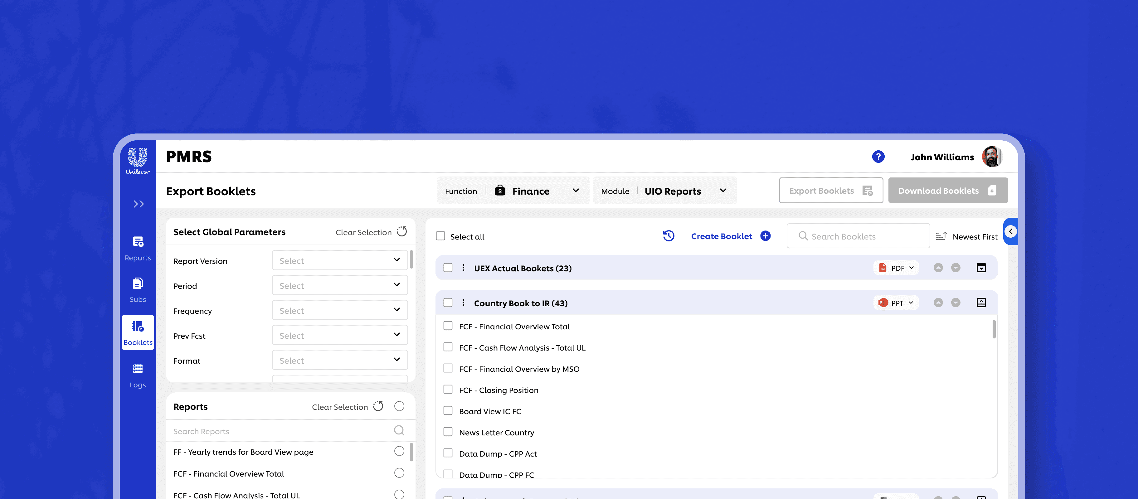
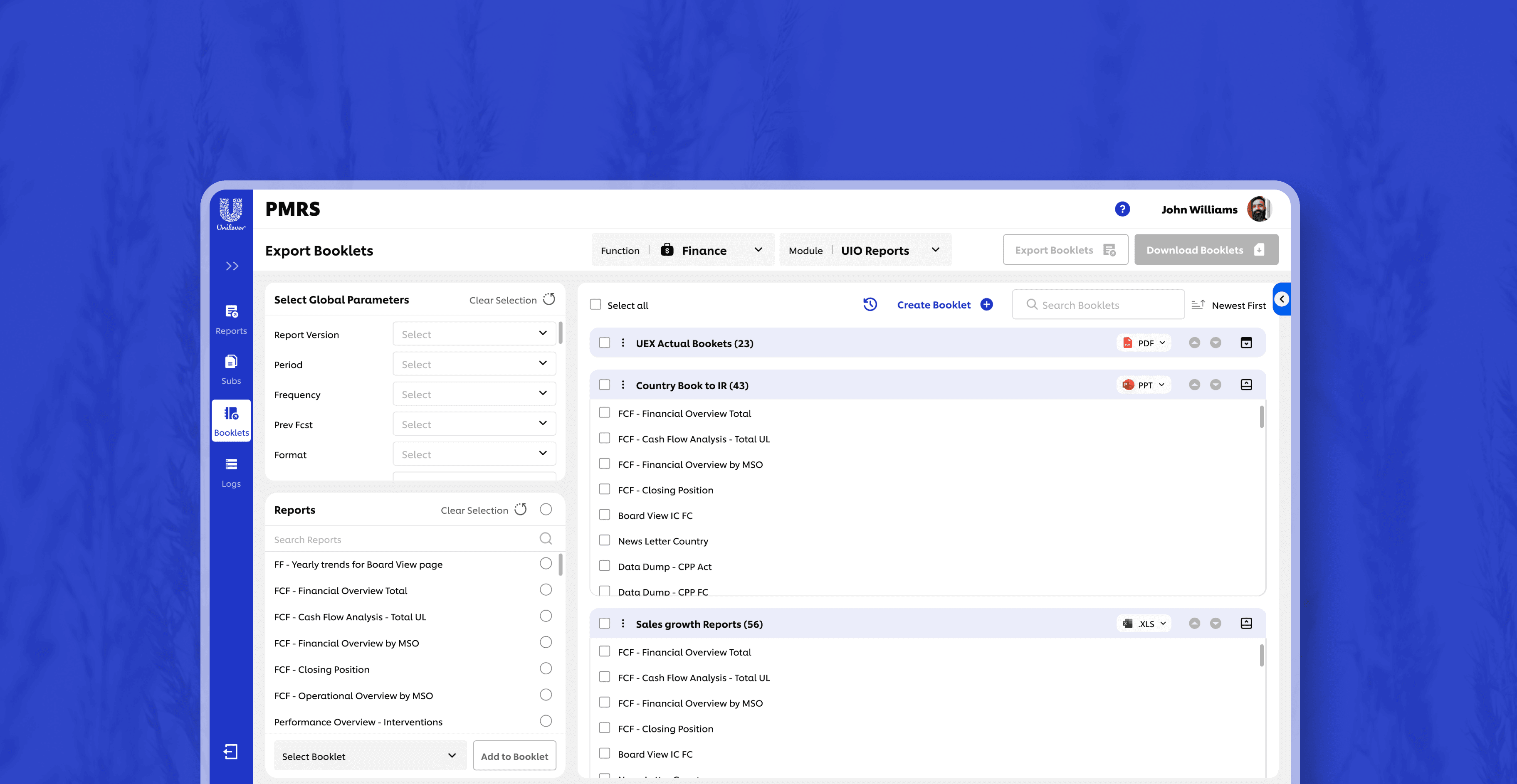
Innovative & Flexible way to Report Export
One of the core improvements introduced is a flexible report exporting system that gives users control over how they access and share information. Users can now export reports in three intuitive ways.
Single Report Export – Quickly download individual reports on demand.Booklet Export – Combine multiple related reports into a consolidated, well-structured document. Subscription Export – A lightweight, personalized export method that allows users to select frequently used reports and export them together as a reusable bundle

In page Export functionality
Designed a solution that enables users to export reports asynchronously, allowing them to initiate multiple report generations without waiting for each export to complete. Also allows users to work on other stuffs parallell`y. This parallel workflow significantly improves efficiency for the report generation team.

Enabling Data Extract
Proper Error Handling
Handled errors in such a way that users can easily recover from them. Provide clear error messages and allow users to recover easily from mistakes.

Proper System Feedback
Use of toasts, snackbars, and loading indicators for every key action. Success messages with next-step suggestions, A notification center showing status of tasks (upload complete, report queued, etc.)

Modern UI with Consistent Components
Designed with modern UI compoents for responsiveness and clarity, which reduced reduced visual clutter, added consistency and interaction steps with clean layouts.

Brand Coherence
Designed the tool with all the required brand guideline which ensures that your brand's visual language is consistently applied across all digital touchpoints, promoting a strong and coherent brand presence.
Making things accessible
I designed the entire application considering the basic accessibility checks and made sure it is accessible across all user groups by checking things like, color contrasts, headings structures and labels, form field labels, proper links and buttons, tooltips, indicating required fields etc.

Impact
Stakeholders reported smoother month-end cycles and better collaboration across teams. Support tickets related to usability dropped significantly. Reports became more accessible through automated data extracts and flexible export formats, including Booklet and Subscription options
Some numbers for context
45%
Task completion time reduced
85%
reduction in onboarding effort
2X
Times Improved Productivity
75%
error reduction in user navigation errors