
Client
Client
Rubycup
Skills
Skills
UX Design
UI Design
User research
Prototyping
Styling
Data & Analytics
Interaction design
Time line
Time line
Dec '21 - Jan '22
Dec '21 - Jan '22
Dec '21 - Jan '22
Team
Team
1 X Designer, 2X Developers,
1 X Business Analysts.
50%
50%
Improved sales
Improved sales
The new design resulted in better sales growth selling products 2x times that ever before.
70%
Increased user retention rate
Increased user retention rate
Visually appealing and well-designed content captures attention and keeps users engaged, crucial for retaining visitors and encouraging them to explore offerings.
2x
2x
Times increase in conversion
Times increase in conversion
Greater conversion rates, users seems to explore the product checkout flawlessly with great ease of use.
About
About
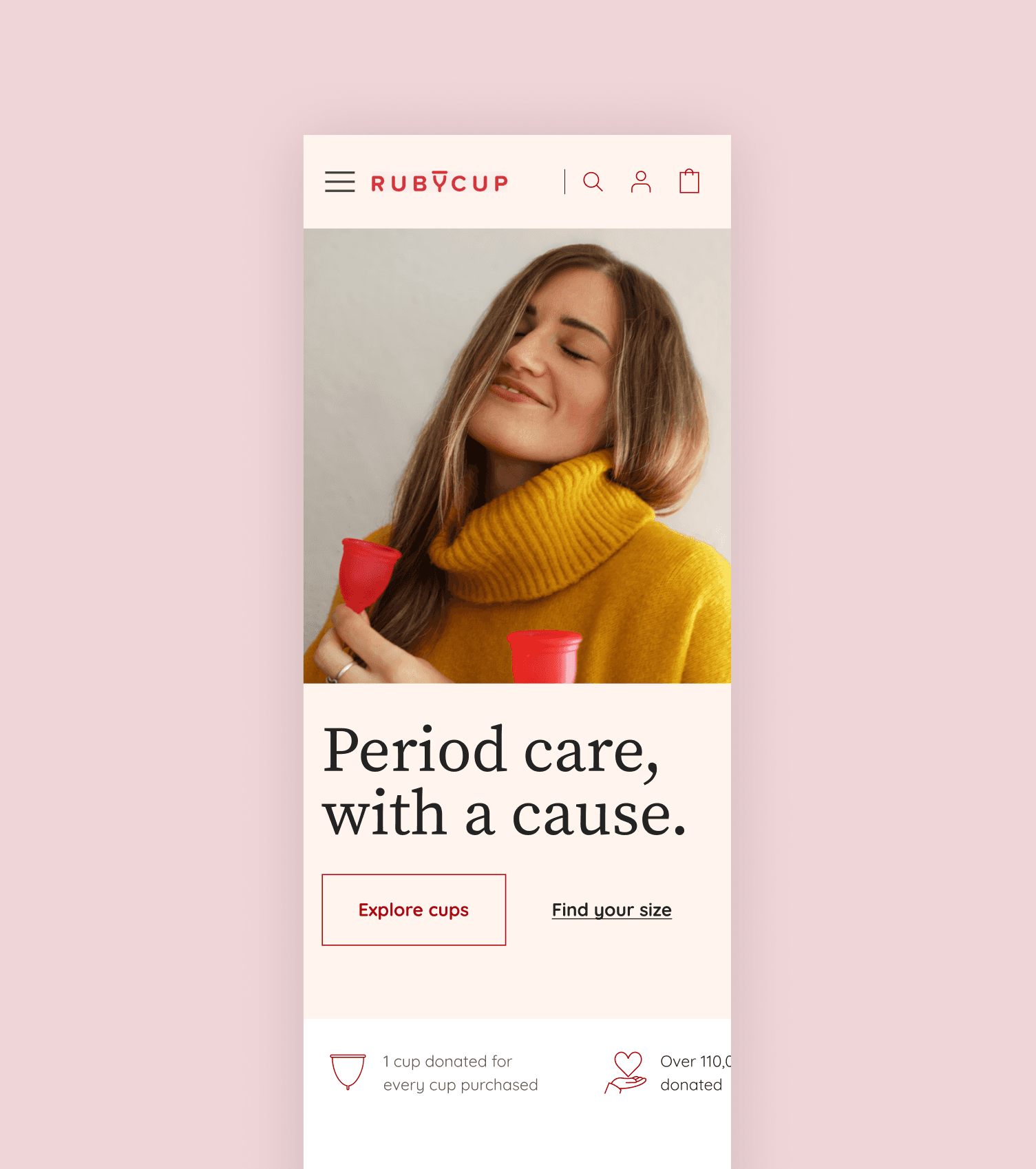
Ruby Cup sells menstrual cups, sterilisers, Kegel trainers, and panties for women in England, Germany & USA. They want to redefine the user experience for their eCommerce site.
Also they had plans for scaling up their service accross more regions of Europe and UAE.
Ruby Cup sells menstrual cups, sterilisers, Kegel trainers, and panties for women in England, Germany & USA. They want to redefine the user experience for their eCommerce site.
Also they had plans for scaling up their service accross more regions of Europe and UAE.
About
Ruby Cup sells menstrual cups, sterilisers, Kegel trainers, and panties for women in England, Germany & USA. They want to redefine the user experience for their eCommerce site.
Also they had plans for scaling up their service accross more regions of Europe and UAE.
Roles & responsiblities
Roles & responsiblities
Being the sole designer of the project I had to take all the responsibility of the entire design needs.
Being the sole designer of the project I had to take all the responsibility of the entire design needs.
Roles & responsiblities
Being the sole designer of the project I had to take all the responsibility of the entire design needs.
Business Goals
Business Goals
Business Goals
To create a smooth experience, establishing a solid foundation for Ruby Cup's scalable, modular, and easily navigable store. To offer a design solution that minimises bounce rates and maximises conversions. Identify the issues and refine them accordingly.

Research Phase
We actually started with secondary research as we had no scope for primary research here. We used Google analytics to understand the user behaviour and to extract the real time data.

User Persona
Ruby Cup is positioned at a young adult audience of working professionals (mainly women) who are acutely aware of menstrual hygiene and best practices. They’re internet savvy, highly engaged in social media, and frequent eCommerce shoppers. They’re also in tune with modern trends and boutique products.
Extracting and Understanding users data


At the end of research
At the end of research
At the end of research
Using the above users data we were able to understand the users behaviour and this helped us to start our design direction.
UI/UX Audit
We conducted a quick audit to validate the current state of the site and through this review, we discovered aspects that aren’t resonating with the users.
Defining the problems and solution.
After using all the research data and UX audit data, we were able to define the problems that the site is facing currently.
Problems we defined
Problems we defined

The overall site looks cluttered and outdated.
Page layout is currently packed, and can be made product centric.
The overall look and feel is too harsh and doesn't convey the actual brand personality in a calm way.
The site is just selling the product it isn't conveying the experience of the product.
The current checkout is complex.
There is no humanizing factor.
No language options given for users from different geographies.
Poor information archietechture. Difficult for users to find certain key informations.
Problems we defined
The overall site looks cluttered and outdated.
Page layout is currently packed, and can be made product centric.
The overall look and feel is too harsh and doesn't convey the actual brand personality in a calm way.
The site is just selling the product it isn't conveying the experience of the product.
The current checkout is complex.
There is no humanizing factor.
No language options given for users from different geographies.
Poor information archietechture. Difficult for users to find certain key informations.
Solutions Implemented

Use Content To Educate & Empower: First timer users need instructions, guides, and questions answered to warm up to the brand. We spoke to women to understand their initial concerns. We also mined the Ruby Cup website and found nice informational nuggets that we wanted to feature.
These can be achieved through FAQs, guides on insertion and removal, and blog posts.
Use Simple Conversion Touchpoints: Our first objective is to make conversion easier and simpler. So the first thing we did was to identify and reduce friction and clutter.
We came up with the simple layout conveying the actual value proposition of the brand.
At the product page, we want to improve the AOV through a seamless UX without sacrificing the flow of it.
Highlight The Social Cause: Ruby Cup’s heart is in the cause that it stands for, and in fighting period poverty. This has to come across in the website - in terms of initiatives, how customers are helping in fighting the good fight. This is another point we wanted to highlight.
Highlight The Social Cause: Ruby Cup’s heart is in the cause that it stands for, and in fighting period poverty. This has to come across in the website - in terms of initiatives, how customers are helping in fighting the good fight. This is another point we wanted to highlight.
New softer look and feel: We came up with the new look and feel understand the users persona and brand personality.
New softer look and feel: We came up with the new look and feel understand the users persona and brand personality.
Building trust and conveying the use case: Generally new users had a fear about this product, we came up with the approach conveying how simple this can be used and how safe the product is.
Building trust and conveying the use case: Generally new users had a fear about this product, we came up with the approach conveying how simple this can be used and how safe the product is.
Designing for all: Implemented all the necessary things like language and currency selection options giving importance for all the users.
Designing for all: Implemented all the necessary things like language and currency selection options giving importance for all the users.
Prioritizing mobile-first design: Given that a majority of our user base accesses the site via mobile devices, we adopted a mobile-focused approach which met the needs of these user groups effectively.
Prioritizing mobile-first design: Given that a majority of our user base accesses the site via mobile devices, we adopted a mobile-focused approach which met the needs of these user groups effectively.
Multi use Components: This enabled us to achieve uniformity throughout the site, thereby enriching the users' comprehension of its use case.
Multi use Components: This enabled us to achieve uniformity throughout the site, thereby enriching the users' comprehension of its use case.
Use Content To Educate & Empower: First timer users need instructions, guides, and questions answered to warm up to the brand. We spoke to women to understand their initial concerns. We also mined the Ruby Cup website and found nice informational nuggets that we wanted to feature.
These can be achieved through FAQs, guides on insertion and removal, and blog posts.
Use Simple Conversion Touchpoints: Our first objective is to make conversion easier and simpler. So the first thing we did was to identify and reduce friction and clutter.
We came up with the simple layout conveying the actual value proposition of the brand.
At the product page, we want to improve the AOV through a seamless UX without sacrificing the flow of it.
Highlight The Social Cause: Ruby Cup’s heart is in the cause that it stands for, and in fighting period poverty. This has to come across in the website - in terms of initiatives, how customers are helping in fighting the good fight. This is another point we wanted to highlight.
New softer look and feel: We came up with the new look and feel understand the users persona and brand personality.
Building trust and conveying the use case: Generally new users had a fear about this product, we came up with the approach conveying how simple this can be used and how safe the product is.
Designing for all: Implemented all the necessary things like language and currency selection options giving importance for all the users.
Prioritizing mobile-first design: Given that a majority of our user base accesses the site via mobile devices, we adopted a mobile-focused approach which met the needs of these user groups effectively.
Multi use Components: This enabled us to achieve uniformity throughout the site, thereby enriching the users' comprehension of its use case.


Thanks for looking at my Project!
If you have any more questions or want to know more details, please don't hesitate to contact me. For now, please consider checking my other work, my experiments, or learn more about me.
More Works More Works
More Works More Works

PMRS
Streamlining and Simplifying Data & Reporting operations for Unilever's D&A team
2024
2024
PMRS
Streamlining and Simplifying Data & Reporting operations for Unilever's D&A team
2024
2024
PMRS
Streamlining and Simplifying Data & Reporting operations for Unilever's D&A team
2024
2024
PMRS
Streamlining and Simplifying Data & Reporting operations for Unilever's D&A team
2024
2024

COALESCE
Event management application for Deloitte India
2023
2023
Hella store
Event management application for Deloitte India
2023
2023
COALESCE
Event management application for Deloitte India
2023
2023
COALESCE
Event management application for Deloitte India
2023
2023

